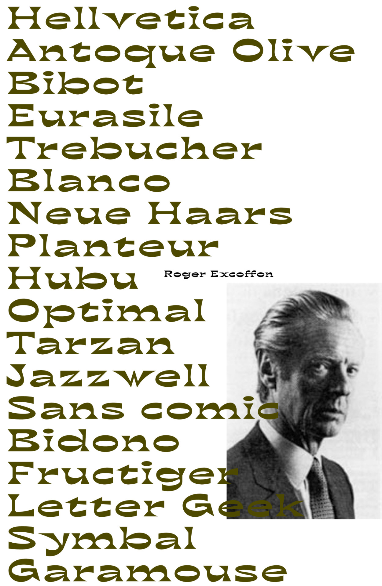
bb-book contrasted ^
"Breaking the rules is essential in moving forward. Challenge the legacy without hating it." - Benoît Bodhuin
Tell us about your latest typeface bb-book contrasted – what inspired its aesthetic character?
The bb-book contrasted is a very contrasted alternative of the bb-book A bold. The starting idea is to mix the curve and straight in an unusual way. This idea very quickly leads the drawing to an awkward distribution of contrasts; so, the rule-breaking nature of the typeface.
You seem to have a lot of fun with type design – how do your type inventions come about? Are they born in the context of a particular design commission and then developed?
I remove myself from the pressure of the design commission to allow myself to work on my projects freely. That gives me satisfaction. Some typefaces are made for fun and others are commissions, such as for Kiblind magazine, but the starting point of each one is desire and an idea – such as exploring contrast or punching. That gives rise to the forms, which lead to the creation of the alphabet. The strict application of this idea gives some difficulties in drawing. Each one is an opportunity to be creative, to find an original form: a new translation of the idea into drawing. And then, as each type designer experiences, making the type homogeneous, without losing either the idea or the drawing.


No comments:
Post a Comment