Thursday 12 January 2017

OUGD601 - Module Evaulation

Module Evaluation

Overall, I found OUGD601 to be an extremely challenging module in terms of time management and motivation. However, I do feel a sense of accomplishment now that it has been completed. I expanded my conceptual understanding of my practice into new areas not previously explored, and I now feel that I am able to better understand the motivations and influences behind my personal practice.

The written aspect of the project resulted in a diverse exploration of highly topical themes facing the field of graphic design, in which I take great interest. I developed a strong critical argument through undertaking both extensive secondary and primary research, which provided me with insightful stances on the array of contemporary themes within visual culture. On reflection, it would have been beneficial to conduct wider primary research, perhaps in the form of more interviews with varied practitioners; however, the attained research was more than appropriate to this specific paper.

The practical element was enjoyable, as my research theme granted me to run wild with highly conceptual themes and allow for a lot of experimentation. I do feel that within the timeframe of this module, I was unable to fully explore every potential of my practical concept, and therefore believe that it has the capability to be developed much further and perhaps extended into a more realised body of work. On the other hand, my research theme facilitated a certain sense of incompleteness in the practical work, The multiple outcomes reflect the sheer plurality and multiplicity of graphic design in the digital era, as in the digital era, a concept can never truly be realised until it is sent to print.


To summarise, I feel I have produced a well synthesised research project which tackles a highly diverse topic in a way that was relevant to my personal concerns and interests. Admittedly, the theme I chose to explore was extremely broad, perhaps too broad. I was highly ambitious going into this module, which in hindsight was a positive and negative thing. This ambition meant that I wasn’t able to cover every topic I intended to in the essay, however, I succeeded in producing an essay which I feel covers the most significant themes in relation the theme. I would like to continue researching this topic, but will definitely endeavour to narrow my concerns down in future research projects, to develop a more refined understanding of the issues facing contemporary graphic design. 

OUGD601 - Practical Synthesis

Through conducting extensive primary and secondary research, I discovered that many practitioners operating in the current moment feel as if contemporary graphic design culture is unable or perhaps unwilling to progress into the future. In this ‘speculative time-complex’, ‘there is a kind of suffocation, to the extent that most people have the feeling of not being able to gain traction in the present, to change something, or to have something like a future worthy of its name.’ (Avanessian & Malik, 2016)

Visual culture would seem, therefore, to have settled into a ‘complacent middle age’ characterised by continual oscillation between the binaries of Modernism and Postmodernism. ‘Even in its more radical guises, design has become self-admiring and masturbatory: a condition utterly alien to innovation and the forging of new directions.’[i] (Shaughnessy, 2003)  

Until the mid 20th century, the act of manifesto writing commonly instigated development within the field graphic design. It diminished under Postmodernism, as the spread of post-structuralist philosophy essentially negated their necessity. In the current moment, manifestos have become even less relevant, now only used by speculative groups such as Metahaven and Experimental Jetset. Certainly without their presence, aesthetic revolutions are harder to disseminate, thus design culture and practice begins to enter a ‘meta-stable’ condition of stagnancy. (Åbäke, 2016)

In order to negate this condition, a return to critical autonomy and self-reflexivity will most likely be necessary.[ii] (Blauvelt, 2003) The chief aim of the practical work therefore, is to encourage contemporary designers to contemplate the overwhelming multiplicity, plurality and ridiculousness of their present creative landscape. Through offering the potential of ‘relief’ or ‘respite’ in the form the self-help products, practitioners would in theory, be more inclined to assume a more critical, speculative stance within their practice.
Of course, these self-help ‘products’ are completely fictitious; forging conceptual reference to the array of recently coined terms such as  ‘meta-modernism’ (Turner, 2011), and ‘hyper-modernism’ (Duvall, 2014) which feel contrived and phantasmal. I sought to comment on the inaccuracy of these terms through producing an over-abundance of advertising materials for the products which would visually convey these attitudes.

Indeed, I could have designed the advertisements for the ‘Speculative Retreats’ and ‘medications’ completely independently, however, I thought it would be far more appropriate and defiantly conceptual to produce the majority of the content using a combination of digital poster generator apps. In our digital era, applications such as ‘Trend Generator’ (2011) have essentially deconstructed the notion of ‘the designer’, through eradicating the need to employ informed design decisions. In this context, a ‘satisfactory’ composition can be ‘generated’ in a matter of seconds, through combining a limited selection of pre-defined options.


 Of course, I could have designed the advertisements for the ‘Speculative Retreats’ and ‘medications’ completely independently, however, I thought it would be far more apt and conceptual to produce the majority of the content using a poster generator app. In our digital era, applications such as ‘Trend Generator’ (2011) have essentially removed the requirement of the designer through removing the need to employ informed design decisions. Now, in a matter of seconds, a ‘satisfactory’ composition can be ‘generated’ simply by selecting a combination of pre-defined options.

I decided to utilise this tool to produce an abundance of chaotic content, which conceptually links to the conclusion arrived at in my essay. Applications such as Trend Generator fundamentally contribute to the de-formalisation of the practice through encouraging designers, young and old, professional and amateur, to deconstruct and complicate the aesthetics associated with the binaries of Modernism and Postmodernism. Therefore, this body of work is intended to communicate directly to this audience range. Ultimately, these outcomes comment on our technologically dependant superficial design culture in which certain design fundamentals appear to be irrelevant and un-required. 

Within the timeframe of this module, I was unable to fully explore every potential of this concept, and therefore believe that it has the capability to be developed much further and perhaps extended into a more realised body of work.

Admittedly, the final resolutions create a considerable sense of ambiguity and perhaps pose more questions than ‘answers’ to the research theme. However, the nature of the topic is highly expandable, which prompts the question: should it be the role of graphic design to always seek to solve issues? Could it perhaps be viable for graphic design to raise its own questions through a multitude of conceptual offerings? Thus the final ‘resolutions’ exist to instigate contemplation and reflection rather than providing conclusive statements.


[i] Shaughnessy, A. (2003) ‘Laptop Aesthetics’, http://eyemagazine.com/feature/article/laptop-aesthetics-text-in-full
[ii] Blauvelt, A. (2003) ‘Towards Critical Autonomy, Or Can Graphic Design Save Itself?’ http://static1.1.sqspcdn.com/static/f/657946/8150654/1281970667410/va4-1_Blauvelt.pdf%3Ftoken%3DDM77WnQXhaYgdGwpq65mfFTA1qI%253D

OUGD601 - Practical Work Final Resolutions

Through conducting extensive primary and secondary research, I discovered that many practitioners operating in the current moment feel as if contemporary graphic design culture is unable or perhaps unwilling to progress into the future. In this ‘speculative time-complex’, there is a kind of suffocation, to the extent that ‘most people have the feeling of not being able to gain traction in the present, to change something, or to have something like a future worthy of its name.’ (Avanessian & Malik, 2016) 

In response to these conclusions, I set out to conceptualise or suggest a range of fictitious ‘self-help products’ which would serve to provide a sense of ‘relief’ or ‘respite’ from the contemporary condition in which graphic design practice/culture presently resides. In theory, these products/services would prompt creatives to be more inclined to assume a fundamentally critical, speculative stance within their practice. 

For conceptual and deliberately ambiguous reasons, I sought to give the various products contrived names, which make reference to the abundance of ridiculous terms which have recently been coined in attempts to articulate our current moment. 

Of course, these self-help ‘products’ are completely imaginary; making conceptual reference the array of recently coined terms such as ‘digi-modernism’ (Kirby, 2009), ‘meta-modernism’ (Turner, 2011), and ‘hyper-modernism’ (Duvall, 2014) which feel contrived and phantasmal. For example, the medication is named 'Contemporaxphan' and the pharmaceutical company is named 'Simulaceuticals Inc.' I wanted to comment on the inaccuracy of these terms through producing a range of advertisements for the products which would visually convey these attitudes.

Indeed  I could have designed the advertisements for the ‘Speculative Retreats’ and ‘medications’ completely independently, however, I thought it would be far more appropriate and indeed conceptual to produce the majority of the content using a combination of digital poster generator apps which essentially eradicate the need to employ informed design decisions. In our digital era, applications such as ‘Trend Generator’ (2011) have essentially removed the requirement of the designer. Now, in a matter of seconds, a ‘satisfactory’ composition can be ‘generated’ simply by selecting a combination of pre-defined options.

Our contemporary moment is inescapably defined by the presence of digital technology and the Internet. Here, the presence of ‘design generator’ applications such as ‘Trend Generator’ and ‘Travel Poster Generator’ have essentially eradicated the requirement of the human designer and the critical design skills/knowledge they acquire. Now, in a matter of seconds, a composition can be generated by simply selecting and combining a limited range of pre-defined options. 

I decided to utilise this tool to produce an over abundance of material for my practical work, which conceptually links to the conclusions arrived at in my essay. Applications such as Trend Generator contribute to the de-formalisation of the practice through encouraging designers to deconstruct and complicate the aesthetics associated with the binaries of Modernism and Postmodernism. 

Ultimately, these outcomes comment on a digitally dominated design culture in which the designer is essentially un-required. 


Wednesday 11 January 2017

OUGD601 - Research - Use & Modify


Typography in the digital era is an incredibly fluid phenomenon. Use & Modify is a personal selection of beautiful, classy, punk, professional, incomplete, weird typefaces. Open source licenses make them free to use and modify. This selection is the result of deep search and crushes. This selection is yours. The goal: Provide a contemporary set of fonts distributed under libre or open source licenses, handpicked by a typography and free culture lover.   The presence of such websites facilitates designers to distort, abstract and ultimately deconstruct typographic forms, which are all key components of postmodern practice. Digital tools such as these, which can be accessed from anywhere in the world, simultaneously liberate and restrict the designer. They liberate in the sense that they remove the presence of rules and principles, allowing the designer to do anything they wish. They restrict in the sense that they encourage the de-formalisation of the practice. 


Monday 9 January 2017

OUGD601 - Significant Theoretical/Contextual Sources

Ben Duvall - New Modernism(s), 2014


Jon Sueda, All Possible Futures, 2014


Armen Avanessian and Suhil Malik - The Time-Complex: Post-contemporary, 2016


OUGD601 - Practical - Speculative Retreat Concept


I wanted to produce a poster series which linked directly the notions explored in my essay concerning the removal of genuine conceptual thinking and employment of design skills. The posters demonstrate the extent to which the digital workspace has essentially made the designer redundant, or simply obsolete. I was able to design this series of posters by simply typing in a theme into the search bar. The website then provided me with a range of images, with which I simply needed to select the one I saw as being most appropriate. It then offers you the option to detect the colours in the image. You then have the option of adding type, which I did. Then all that is left to do is click 'make poster' and the application renders the image with the colours and condenses everything together. What you end up with is a low-resolution composition which has been completely designed by a machine. 


OUGD601 - Research - The Time Complex

These exerpts are taken from a written discussion between Armen Avanessian and Suhail Malik. They discuss the bewildering notion of the post-contemporary condition, which is distinctly connected to theories of time complex. These quotes have proved invaluable to the concluding section of my dissertation. 

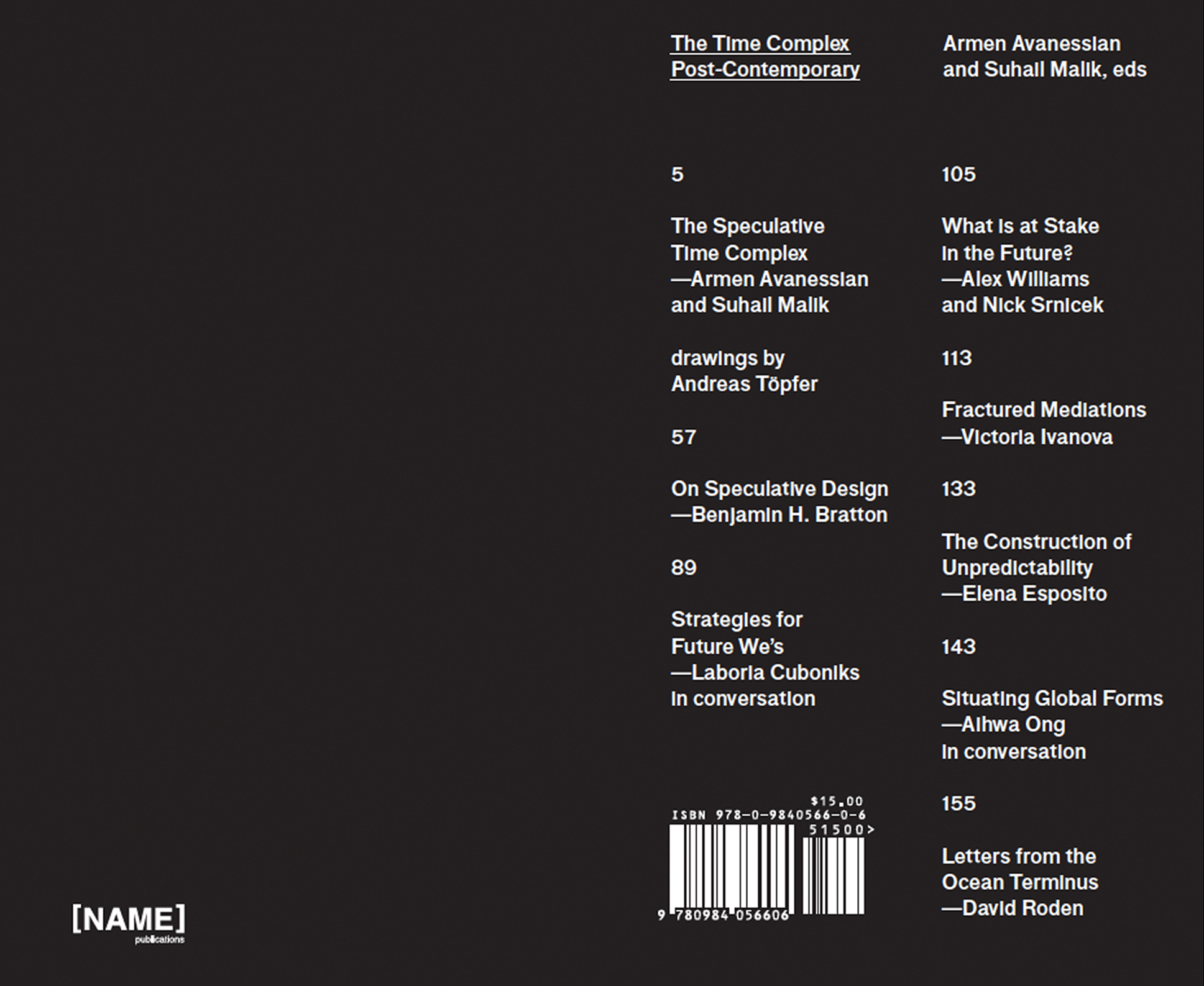
Time Complex – Post-contemporary – Avanessian, Malik, 2016 P: 7 -56

Avanessian: The basic thesis of the post-contemporary is that time is changing. We are not just living in a new time or accelerated time, but time itself – the direction of time – has changed. We no longer have linear time, in the sense of the past being followed by the present and then the future. It’s rather the other way around: the future happens before the present, time arrives from the future. If people have the impression that time is out of joint, or that time doesn’t make sense anymore, or it isn’t as it used to be, then the reason is, I think, that they have – or we all have – problems getting used to living in such a speculative time, or within a speculative temporality.

Malik: The main reason for the speculative reorganization of time is the complexity and scale of social organisation today. If the leading conditions of complex societies are systems, infrastructures and networks rather than individual human agents, human experience loses its primacy, as do the semantics and politics based on it. Correspondingly, the present as the primary category of human experience - in its biological sentience at least – which has been the basis for both the understanding of time and of what time is, also loses its priority in favor of what we could call a time-complex. It is no longer necessary to explain the movement of the past and the future on the basis of the present. We are instead in a situation where human experience is only a part of – or even subordinate to – more complex formations constructed historically and with a view to what can be obtained in the future. The past and the future are equally important in the organization of the system and this overshadows the present as the leading configuration of time. Complex societies, which means more than human societies at scales of socio-technical organisation that surpasses phenomenological determination, are those in which the past, the present and the future enter into an economy where maybe none of these modes is primary, or where the future replaces the present as the lead structuring aspect of time.

Avanessian: What happens in the present is based on a pre-emption of the future, and of course this is also linked to what has been called a tendency towards premeditation in the media.

Malik: Everything now seems to be ‘post’ – something else, which indexes that our understanding of what is happening now has some relation to but is also disconnected to historically given conditions. While the ‘pre’ indexes a kind of anticipatory deduction of the future that is acting in the present -  so that the future is already working within the now, again indicating how the present isn’t the primary category but is understood to be organised by the future – what the ‘post’ marks is how what’s happening now is in relation to what has happened but is no longer. We are the future of something else. The ‘post-’ is also a mark of the de-prioritization of the present.

If we are post-contemporary, or post-postmodern, post-internet, or post whatever – if we are post-everything – it is because historically-given semantics don’t quite work anymore. So in a way, the present itself is a speculative relationship to a past that we have already exceeded. If the speculative is a name for the relationship to the future, the ‘post’ is a way in which we recognise the present itself to be speculative in relationship to the past. We are in a future that has surpassed the conditions and terms of the past.

Combined, the present is not just the realization of the speculative future (the pre), but also a future of the past that we already exceeding. We don’t quite have the bearings or the stability or the conventions that the past offers to us (the post).

Avanessian: The shaping of the present is not necessarily determined by the past. The present can no longer primarily be deduced from the past nor is it an act of pure decisionism, but its shaped by the future. That’s the key problem and key indication that the logic of the contemporary with its fixation on the present – the human fixation on experience – that this presentism has difficulties or even completely fails in dealing with the logic of being constituted by the future. That’s partly the reason for all the critical reasoning and questioning of contemporaneity in recent years that happened parallel to the so-called speculative turn.

Speculative realism has mostly argued for an intra-philosophical or conception notion of speculation, which is to think of the outside of though and the experience of thought. The interest of the post-contemporary is to understand and operationalize the present from outside of itself.

Malik: The future is acting now to transform the present even before the present has happened. It is not only the linear schematic of time that is scrambled but also the very openness of the present to the future.

Avanessian: The tense system is really important to our understand and construction of time, it structures our experience. ‘Every past was a future’ and ‘every future was a past’ – these basic structural paradoxes can be tackled via an analysis of grammar.

Malik: The identification of the speculative time-complex we are here calling the post-contemporary is that they articulate a time structuring in which the present drops out. So determinations of time can be established that don’t require the present as their basis.

What we have with the speculative time-complex is that the future, which includes the future we don’t know, gets included within the current reckoning, and the present is becoming disconnected from the past. The dismantling of the linear ordering and the primacy of the present equalizes the past, present and future.

Avanessian: The present is not fully experiencable but is split in itself. The tense structures can actively operationalise this splitting. It is laden with innumerable past-presents. It presents actual phenomena as post-X phenomena and it desynchronizes time.

Malik: The future itself becomes part of the present. This could be taken as an extension of the present without a future radically distinct from it. And it often is, with the leftist-critical claim of the loss of futurity under the capitalism of complex societies. (Link to Jameson’s theories)

Avanessian: With left-critical reactions, there is a kind of suffocation, to the extent that most people have the feeling of not being able to gain traction in the present, to change something, and to have something like a future worthy of its name.

Malik: What the right does is to simplify the time-complex, reduce it and re-centre it on the present as the dominant moment on the basis of tradition. The right has always done this in modernity: if modernity is a paradigm in which the new happens in the now, what has characterized the right is a defense against the emergence of the new as the basis for actions, social organizations, aesthetics, meaning and so on. The authority of past conditions is invoked as a stabilization mechanism for modernization. The right is not necessarily against modernization but stabilizes its disruptive effects by calling on what are then necessarily conservative or reactive historical formations. And faced with operationalised speculative time-complex of neo-capitalism, the right can in a way carry on doing what is has always done without necessarily reorganizing that what it is reacting against is no longer the modern but a new condition.

In a way, leftism makes the problem of the contemporary more evident because the left in its progressive forms has been attached to modernism. Instead of seeing the future as the condition of the present, the present is instead taken to extend out indefinitely and cancel out the radically different future.

The speculative present as we are identifying it is, by contrast to this leftist melancholy, the entrenchment of the future and the past which folds into the present, in a way that certainly de-prioritizes it and maybe even makes it drop out. The past was the future, and the future will be the past.

There us no critical interruption from the present in this speculative present. It is constructed by the uncertainties of the future and the absence of the past. That’s why the left-critical thinking of the event or the emptiness or openness of the present – of contemporaneity – is still vestigially modern. It’s not adequate to the tasks and conditions of the twenty-first century.

Avanessian: What the left sees in the speculative complexification of time is an extension of the present that than its thinning out by the forcing of the future or the disestablishment of the past. Historical, futural, anticipatory relationships are maintained with an emphatic insistence on the presentness of action, aesthetics or experience. The 'contemporary' is a time form that saturates both the past and the future, a meta-stable condition.

A leftism still attached to Modernism won’t have traction on the speculative present, even if the leftism is more attentive to the time-complex than the right because it is not trying to restore the past. Even it its accepted that the left is more open to modernity than the right, it holds that the present extends into both the past and into the future, which supposedly destroys the future as a future.

Malik: The present now is not the time in which the decisions are made or the basis for the new, as it was in Modernism. The new is happening instead in a transition between the past and a future that is not a unidirectional flux, but a speculative construction in or from the directions of past and present at once.

Under the guise of the contemporary, the modernist left has a kind of melancholia for a future that it cancels to preserve its received premise: the present. The past and the future are taken as modifications of the present. The advantage for left-criticality is that the contemporary can then accommodate, dissimilate, colonize all of time in its own terms.

Avanessian: Contemporary critical art mostly produces different – essentially decorative – objects or meanings that maintain the reduced form of the speculative time complex. The post-contemporary works within the speculative present, it understands it, it practices it, and it shapes our temporality.

Malik: The future is only just a set of potentials that must never be actualized for fear of instrumentalization and, paradoxically and self-destructively, realizing in any present a future radically distinct from the present.

We have to open up the time-complex in its infrastructures that are more structured in terms other than those of human languages. Even more generally, we need a grammar adequate to the expansive infrastructure of the time-complex in its widest formation.


Saturday 7 January 2017

OUGD601 - Research - The Global Style, Jeffrey Keedy

This essay by Jeffrey Keedy is highly significant in relation to my research topic. He basically articulates the reasons behind many of the aesthetic characteristics which have come to dominate much of contemporary graphic design visual culture. I really like his writing style and his critical tone of voice. 
‘Space in the Global Style is flat to the point of non-existence. Although there is almost always some layering of a tedious geometric shape on top of an insipid block of text, the effect is still one of simultaneity and flatness as the overlap is usually transparent. The picture plane is not composed, it is just temporarily occupied. The hierarchy of forms is designed so that everything within the composition is of more or less equal unimportance. Some words go this way some go that way, here it is, easy to read, easy to look at, everything in place filling the page up nicely. Since the page is so evenly filled we read it as instantly “complete” or “done”. It requires very little of the audience in terms of interpretations or participation. It functions like cultural “wallpaper” it is easy to ignore.
The International style used typographic trickery to animate the flat picture frame with the illusion of depth and space. Borrowing from music and video, the Global Style uses the 4th dimension of time, or rather a reference to time, to animate the 2D space. It accomplishes this by looking like it was a single frame taken out of an animated sequence. One can easily imagine many different iterations before and after the one we are currently seeing. The overlap of disparate imagery looks like “screen burn” or “ghost images” that would make more sense seen individually or sequentially. In this way, the Global Style extends beyond itself forward and backwards in time but not in space. It is very emblematic of our transient culture, it's a move that hits the zeitgeist right on the head, making it more relevant that the old International Style with its analogue abstractions of the 2D space.
What the Global Style took from Postmodernism is a taste for the vernacular, the quotidian, the punk inspired anti-aesthetic and an interest in language. This is where the “ugly” font and colour choices come from as well as the squashed type and the frames around the outside and inside the frames within frames, the overt use of languages and diagrammatic symbols, the slash, the underline etc. Centre axis typography was used as a historical reference in postmodern typography, but in the Global Style it is simply an easy auto default setting, randomly deployed.
Designers of the postmodern era were accused of aesthetic self-indulgence with all the computer stunts, historical quotation, formal contortions and time-consuming complexities. No one can accuse the designers of the Global Style of aesthetic self-indulgence since pretty much anyone can design like that, and do it quickly. Obviously, their self-indulgence is not an aesthetic one, but a social one. Forget about print, digital, motion, environmental or interactive media, because it’s social media that has the biggest impact on design today.
Should design studios really put the bulk of their efforts into “projects” of their own division tat are of no use or interest to anyone but themselves and a few underemployed friends? Feeding your blog, Instagram, Tumblr, and Twitter account is self-promotion, but is it design? The fact that you are busy doing design doesn’t mean you are a designer, any more than the fact that you are busy cooking makes you a chef. Design is for somebody besides you!

Today it is taken for granted that graphic designers have a cultural role to play. We won the battle, we have our autonomy. But is this how we want to use it? Replicating art world practices, and recycling old styles for each other? Is being an institutional servant somehow better than being a commercial one? Better for who?
The Global Style, like the International Style before it, will be with us for some time to come. It is the new normal, or base from which a multitude of stylistic liberations and reactions will evolve. Every era and culture gets the style it deserves. What did we do to deserve this? Or maybe it's something we didn’t do?’  


The Global Style, Keedy, 2015 

Wednesday 4 January 2017

OUGD601 - Practical Work - Posters

I created these posters using Illustrator to advertise the fictitious medications. Their aesthetics are directly influenced by work witnessed on Trendlist. They deliberately appropriate this style, which in turn makes reference to the design culture of today which is dominated by superficial pastiche, repetition and insular gratification. 


Tuesday 3 January 2017

OUGD601 - Breaking the Rules & Playing with Legibility


bb-book contrasted ^

"Breaking the rules is essential in moving forward. Challenge the legacy without hating it." - Benoît Bodhuin

Tell us about your latest typeface bb-book contrasted – what inspired its aesthetic character? 

The bb-book contrasted is a very contrasted alternative of the bb-book A bold. The starting idea is to mix the curve and straight in an unusual way. This idea very quickly leads the drawing to an awkward distribution of contrasts; so, the rule-breaking nature of the typeface. 

You seem to have a lot of fun with type design – how do your type inventions come about? Are they born in the context of a particular design commission and then developed? 

I remove myself from the pressure of the design commission to allow myself to work on my projects freely. That gives me satisfaction. Some typefaces are made for fun and others are commissions, such as for Kiblind magazine, but the starting point of each one is desire and an idea – such as exploring contrast or punching. That gives rise to the forms, which lead to the creation of the alphabet. The strict application of this idea gives some difficulties in drawing. Each one is an opportunity to be creative, to find an original form: a new translation of the idea into drawing. And then, as each type designer experiences, making the type homogeneous, without losing either the idea or the drawing. 


OUGD601 - Liquid Identities/Liquid Modernism

In the contemporary moment, visual identities, in particular, logo design is a flexible affair. Gone are the days when the humble logo-type or iconic logo would suffice as the main visual component representing a brand, product or cause. These are commonly known in the field as 'flexible identities'.

There has been a growing interest in flexible visual identities in the last ten years, with lots of design studios starting to abandon the idea of the logo as the centrepiece of a visual identity, instead dedicating their practices to the development of visual systems. These visual systems are coherent yet eclectic and excitingly diverse, ultimately challenging the conventions of Modernist identity design. 

Some call them ‘dynamic identities’, some ‘liquid’ or ‘fluid’ identities (referring to Zygmunt Bauman’s term ‘liquid modernity’). Further, ‘generative’, ‘responsive’, ‘evolutive’ or ‘living’ are all terms used to describe flexible visual identities. What all these terms have in common is an attempt to describe flexible visual identity as the opposite of the static visual identity, based on a static logo design.

For me, liquid identities are representative of the current condition in graphic design practice. They reflect an urge to be experimental whilst functional, intersecting the avenues of modernist and postmodernist mindsets. That is to say, these identities aren't without their restrictions, as all successful identities usually are. However, the restricts allow for more freedom, as they aren't as strict as say the brand guidelines for a huge, international sportswear brand.

A good example of this can be seen in the visual identity for the 2015 Beijing Design Week.
The design for the Beijing Design Week 2015 is based on a few visual elements and their ability to be transformed, stretched or jolted. It is a closed system because the elements are pre-defined, no new elements can be added. The elements and their ability to stretch or jolt and the various ways how the visual system can be applied to different items makes the VI flexible. 


F5b1d669 5659 4172 9e97 99083d736998

Large 37fc26fa a460 4747 945e b5a9f5971d37

Large 29ec1521 1ba3 4531 8691 1fbe90dcaddf

Another great example is the identity for MK Gallery, designed by Sara Dabont. This identity involves a logotype comprised of six distinctly different typefaces. The logo is displayed as an independent GIF which demonstrates its liquid state well. On the gallery website, the logo can be found at the top left-hand corner. Each time the page is 'refreshed', the logo changes, subtly revealing its liquid quality to the user of the site. 


Full article - https://www.grafik.net/category/feature/flexi-time

OUGD601 - Manifestations of 'Hyper-reality'

Featuring virtual desktop windows, stickies, folder icons and even an open iCal calendar, the campaign collateral for this year’s Singapore International Photography Festival resembles a series of Mac screenshots. Well, that’s because they are. The designers intentionally chose to include visual elements directly associated with the production of the design's aesthetic. 

“Photographs are circulated more than ever online. You may not even have a gallery space or a museum showcase, you can just circulate them on Facebook and Instagram or email your work to somebody,” explains the studio’s creative director Hanson Ho. “A lot of photographs are actually stored in desktop folders, not so much on shelves.” According to Ho, this means photographs and their archives can no longer be thought of as records of truth. Instead, they are “constructs” that anyone can create, Photoshop and disseminate—an idea that Ho frames by presenting the desktop interface and its elements across the festival’s invites, banners, passes, and catalogue. The virtual TextEdit window was even recreated as physical frames to hold wall texts for the festival’s public exhibitions of photographs from around the world.

http://eyeondesign.aiga.org/designing-a-photography-festival-campaign-with-screen-shots/ 

What this work demonstrates to me is the conscious inclusion of signs and symbols which have no physical reference, as they exist solely in the virtual sphere. This is a direct manifestation of a hyper-reality, as the boundaries between the cyber world and 'real world have blurred and completely merged. The motivation behind this particular design treatment is evidently conceptual and purposeful and reveals both Modernist and Postmodernist influence. It can be viewed as Modernist in the sense that it contemplates the current moment and responds directly to it; undeniably self-reflective and referential. However, it is this self-referential quality that gives it a Postmodern flavour. It is the ultimate form of pastiche because it is quoting a reference that is in essence, non-existent. 


Further examples of simulacra/hyper-realities, mainly in poster design:

Yale— Graphic Design:


Ben DuVall:

全部尺寸 | KORNER │ issue │ NO.016 issue | Flickr - 相片分享!:

Source: hamcruise:

f14+Sputnik_Career_PosterBack_rbg-01.png:

OUGD601 - Rory King Essay Excerpts

'It is unfortunate that a large majority of contemporary graphic design is nothing but an act of self-preservation to stay “relevant,” to get respect from other designers and to be published on blogs visited by only designers. We have lost ourselves within this plethora of aesthetically pleasing, warm-feeling nostalgic drivel and it seems like the present day love for illustrated typography and graphics is cementing itself as the end-all way to design. As graphic designers we should be able to adapt to a client’s needs and be enthralled with the notion of creating and developing a variety of new cultures; we should not be satisfied with our profession idling in a period of imitation, waiting for someone to create something new that can be copied, again.


This has been said before and it bears repeating: design is not a noun, it is a verb. Illstaglia conveys graphic design as a “thing” to users, consumers and clients. For practitioners, illstalgia promotes individualism that only other designers can appreciate. We all want something that is aesthetically pleasing and illstagia achieves that but only that. Thoughtful design, developed through a process, creates artefacts that have longevity and improve lives with an equal, if not greater, aesthetic allure. I am not saying illustration has no place in the design field nor am I saying that illstalgia is ugly. What needs to be understood about this trend is that it is simply that: a trend. As students we cannot develop our portfolios around a style. As professionals we cannot attribute a style onto a client because it is currently trending. As practitioners we cannot drown ourselves in our practice’s obsessions. We must live up to the title of designer not copycat.'

This excerpt relates nicely to my section on anti-aesthetics and speculation. It is highly opinionated but grounded in an informed, authentic theoretical background. 

'Lost In Illstalgia', 2014

“Who you are is not a function of where you are,” is a quote I recite to myself when moments in life have me down. It can mean a myriad of things, such as living in a major city doesn’t equal success, or being raised in an impoverished environment doesn’t mean you can’t become successful later in life. The same rings true with the idea of killing off the term “graphic design.” Just because you call it something else doesn’t mean its maladies disappear and people (practitioners or otherwise) are suddenly in concurrence. Conversely, just because the term has been defaced doesn’t mean we can’t fix it. At a time in which the public sphere is interested and invested in our discipline, we need to be honest about who we are and what we are doing as a profession and as a discipline. To quote Peter Hall’s The Uses of Failure lecture, “we don’t need to justify design’s importance to the world or to the art establishment. We need to look into how design works and where it is going wrong. We need a new generation not to venerate design but to sniff out failure.”

'The Future of What', 2015

OUGD601 - Jarrett Fuller - Considering the Death of Graphic Design

Considering the Death of Graphic Design - 2015
“He not busy being born is busy dying.” —Bob Dylan
Let’s talk about how graphic design is dying. Because it is, right? That’s what it feels like sometimes. It sounds like the type of thing someone would write an article about on Medium. We can talk about how design is being democratized, or engineering is making design irrelevant, or maybe it’s because designers are just following trends. We’re surely leading this field to it’s obvious obsolescence.
Yet, in a recent interview, Michael Rock said, “We live in an era wherein design has become the central metaphor. Since everything is designed — from genes to global alliances — everything is fair game for the designer.” Design — with a capital D — is shaping our world and designers are leading the charge. So what does this mean for the graphic designer — those of us working with typography and photography, arranging elements on the page and the screen?
My original title for this essay was simply, “The Death of Graphic Design”. I don’t actually believe graphic design is dead but I sometimes wonder if those words, “graphic design”, still make sense for what I do. I wanted to write about how graphic design has become so big, so encompassing that one term no longer makes sense to cover it all. But I realized that’s just semantics. Those are just words and that’s a terribly boring discussion.
But that does bring up an interesting point doesn’t it? If we are going to talk about graphic design’s death—which is really just a dramatic way to talk about its future—we need to be clear that we’re talking about the same thing.
“The goal of graphic design, when it’s good, is to raise the expectations of what graphic design can be.” —Paula Scher
Sometimes I think I don’t know what graphic design is anymore so I looked around to see if I could figure it out. Maybe if I could see graphic design in the world, I could figure out where it lives, what it looks like, and why it’s supposedly dying. Perhaps we can get a better sense of where the field is heading by looking back on it’s future. So what is graphic design?
Graphic design is on our screens, on our buildings, on our freeways, on our media, in our entertainment, and now it’s on our watches! Graphic design, it seems, is a part of everything. It’s embedded into every single environment and experience we interact with all day long. It’s tempting to think this is a new phenomenon — as more and more of our technology gets replaced with software, our screens will multiply and so will our need for graphic designers to help us organize it — but modern society has always been like this. Graphic design has always permeated throughout all of culture
However, what is new is how graphic design is distributed and where it lives. No longer does the work of the graphic designer live solely on the page, confined by edges, now it can also live on the screen, responding to its size to provide an optimum experience regardless of device. It lives in our software, able to be manipulated and interacted with by an unknown viewer. The edges of the page and the constraints of the printer no longer need to hold back the designer. The graphic designer no longer has the last word, but a first in a potentially never-ending conversation. 
Paul Rand is still considered one of the greatest graphic designers of all time — and rightfully so — but he never worked in the mediums dominating our field today. Is it all still graphic design? Is designing an iPhone interface and an album cover really the same thing? Surely we can’t compare Stefan Sagmeister with Paul Rand, right?
“Writing about music is like dancing about architecture.” —Thelonious Monk
When we talk about graphic design, especially its future, we tend to talk about a few different things. We think about styles, about design’s purpose/function, its audience, and the role of the designer. We tend to talk and write and speak about the parts that are important to us while ignoring (and sometimes devaluing) the others. Let’s look at each of them:
  • Style (Designer as decorator). What does it look like? What is it referencing? When we talk about graphic design, we must always talk about its aesthetics—the typography, the colours, the imagery. Trends are styles. This can feel superficial, and sometimes it is, but we must never diminish the importance of aesthetics, styles, and trends in the work we do.
  • Purpose/function (Designer as problem solver). What is this design supposed to do—to provoke, to sell, to convince, to inform, to entertain, to guide? This can be the completed output—an iPhone app, a logo, a poster.
  • Audience (Designer as communicator). Who is the work for? Considering the audience is perhaps the most critical task of the designer and permeates through all of the work. In an increasingly global society, graphic design often has multiple audiences who’ll experience the work in a variety of uncontrolled contexts.
  • The role of the designer (Designer as author). What does the designer bring to the work? This is where discussions around designer as author or designer as editor come from. Does the designer add her own point of view to the work? Are there layers of meaning she’s embedded in the process? Sometimes the designer is initiating the project (owning it completely from start to finish), sometimes they are simply enacting a point of view into a project, and sometimes they are just giving form to a message.
In talking about graphic design, I find it helpful to think of these categories as dials that can be turned up or down depending on the project and the context. Not all of these are equally important nor are they consistently important across every type of work.1 For example, I don’t want a designer embedding meaning or subverting the sign into a commentary on transportation onto my freeway signs, I just don’t want to miss my exit. But in a museum logo, when the designers creates a living mark that evolves with the exhibition, sometimes becoming illegible because they are aware the audience understands it, the designer's point of view becomes more important.
This is why many discussions around graphic design and popular design blogs can feel superficial. Either they are only speaking to one of these or they are weighing all of them the same regardless of context. Judging a logo out of context can only be judged for its style without regard for its audience or purpose. Talking about the interaction models of the Apple Watch only look at its purpose or function without regard for audience or style.
Returning to Paul Rand and Stefan Sagmeister, we can talk about Rand’s midcentury, corporate identity aesthetic versus Sagmeister’s hand drawn, three-dimensional typography but we must also acknowledge that Rand was hired by a corporation and his logos needed to instil credibility. Sagmeister is performing self-initiated projects that will live in a gallery. Both men are operating as graphic designers but they are using the designer’s tools for different goals. We wouldn’t argue whether both a sculptor and a photographer are artists and we shouldn’t see the differences as a value judgment of one medium over the other. Just as the world needs all kinds of artists, we need all kinds of designers.
Some designers will be decorators and some will be critics. The field is big enough for all of us.
“The reports of my death are greatly exaggerated.” —Mark Twain
As graphic design has expanded, we’ve attempted to silo and label these various, often disparate, disciplines: we are interaction designers or typographers, illustrators or design thinkers. There’s digital designers and print designers. There’s personal work and client work. These silos are of our own creation. They can be useful in defining the type of work you do but they can also be divisive and make the field feel fractured.
Frank Chimero wrote about these in his essay, Designing in the Borderlands:
Luckily, these distinctions were drawn by us, which means that we can redraw them. We can move the line, toe it, and breach it with a transgressive practice that tries to turn opposition into symbiosis. But you can only cross the line and confuse the distinction if you commit to the middle space.
These borderlands are the best place for a designer like me, and maybe like you, because the borderlands are where things connect. If you’re in the borderlands, your different tongues, your scattered thoughts, your lack of identification with a group, and all the things that used to be thought of as drawbacks in a specialist enclave become the hardened armor of a shrewd generalist in the borderlands.
Just as wide and varied as the field can be, I can also notice it in my own work. I’ve spent a career in these borderlands—jumping between interaction design, illustration, identity development, and books. A designer can be a specialist or they can be a generalist; they can work in print and digital, for clients and themselves. These walls can be used to build a bigger tent to cover all of us or they can be used to segregate and divide.
Sometimes I get frustrated when I think about the possible futures of graphic design. I look at advancements in technology and medicine and the environment and when I think about my own field, it feels like more of the same. But when I look back at its history and I realize graphic design has never stayed the same. If graphic design is in everything, it will always move forward with the rest of world, continually embedding itself into culture2.
So is graphic design dying? Sure, parts of it are, just as we’ve always left behind the things we no longer need. That’s how the world works. From death comes life. Something has to die so we can eat it and continue living. You can’t enjoy Spring until you’ve gotten through Winter. Maybe we’re killing parts of graphic design to make room for something new.
In his seminal 1970 text, Thoughts on Design Paul Rand defined design’s process:
Visual communications of any kind, whether persuasive or informative, from billboards to birth announcements, should be seen as the embodiment of form and function: the integration of the beautiful and the useful. In an advertisement, copy, art, and typography are seen as a living entity; each element integrally related, in harmony with the whole, and essential to the execution of the idea. Like a juggler, the designer demonstrates his skills by manipulating these ingredients in a given space. Whether this space takes the form of advertisements, periodicals, books, printed forms, packages, industrial products, signs, or TV billboards, the criteria are the same.
Perhaps we’re just continually adding to Rand’s definition. In addition to advertisements, periodicals, books, printed forms, packages, industrial products, signs, and TV billboards, we’ll add interfaces and phones and watches and glasses and thermostats and dashboards. The role of the designer has always shaped how humans interact with the world and with each other.
That role may stay the same, but the opportunities are infinite.

OUGD601 - Jarrett Fuller Essays

I Don't Know What Graphic Design Is - Jarrett Fuller

'Published in 2016, I Don't Know What Graphic Design Is, is a collection of my essays on design, culture, and technology from the last five years. Ranging from criticism, book reviews, and theoretical texts, this book captures my thinking on design and uncovers the common themes that I've returned to again and again. Printed in black and white, using only Helvetica, the simple layout emphasizes the print-on-demand form while also putting the words first.'
Quoted from http://www.jarrettfuller.com/portfolio/design/essays.htm 
This book looks really intriguing and would have provided me with some excellent insight for my essay. Unfortunately it is not currently available for purchase, however, I will try and get a copy soon as I intend to further my knowledge on this topic after COP3 has finished. It will be a nice edition to my personal art/design library. 

OUGD601 - 'Derridean' Devices

'The purpose of Derridean devices was the prevent conceptual closure, or the reduction of his texts to an ultimate meaning. These devices can be clearly seen in Postmodern and contemporary graphic design, for example, the Derridean concept of 'sous rature' - the tactic of putting an idea 'under erasure' by crossing it out, in order to alert the reader not to accept it at face value.' (Poyner, 2003, P; 46)

These devices can be described as 'deconstructivist' and appear regularly in contemporary work. Below are some interesting examples, some of which are commercial, others aimed at smaller audiences:

« RSF: «La liberté de la presse est en recul dans le monde » RFI par Tadef

http://www.letra.com.pt/:

typografika:

JAY Z

Muzieklab Brabant


OUGD601 - Practical Work Synthesis

Practical Work Synthesis

The main endeavour of my dissertation was to attempt an understanding of the current moment within graphic design practice and visual culture. In the conclusion, I articulated our present condition as being somewhat insular, self-referential, repetitive, stagnant and curiously nostalgic for aesthetics from the fairly recent past. My primary and secondary research indicated that many contemporary practitioners currently operating in the field appear to be concerned with aligning themselves to seemingly fast moving, superficial trends. These trends, which lack in any real social, political or cultural drive or commitment, are a means for categorising work on websites such as Trendlist.com. The presence of such websites has produced sectors within design culture which seem to value aesthetic appearance over conceptualism and even functionality. Trendlist encourages designers who are perhaps just entering the discipline to adopt a design process which is solely concerned with ‘final aesthetics’, instead of investing time into research, idea generation and genuine experimentation. In addition, websites such as Tumblr and Pinterest further perpetuate this apathetic state of authenticity and originality, through encouraging designers to imitate favoured aesthetics through the complacent utilisation of stylistic devices. Combined, these influences are largely responsible for manifestations of pastiche and simulacra which only continue to fuel this ‘meta-culture’ in which graphic design appears to be consumed by.

Through my research, I discovered that many of the earliest radical developments in graphic design were fuelled by the act of manifesto writing. Movements such as De Stijl, Constructivism and the New Typography all utilised the prescriptive power that manifestos possess in order to achieve their objectives. In the process, manifesto’s helped form unified ‘anti-aesthetics’, which purposely challenged established conventions within the art world. In contrast, a number of developments that fell under Postmodernism occurred without the presence of manifestos, for example, Deconstructivism and the Grunge aesthetic. These movements, charged by advancements in digital technology and dissemination of post-structuralist theory, produced leaderless ‘anti-aesthetics’ which fundamentally lacked direction and conviction. Since the arrival of Postmodernism, there have been sparse attempts to amalgamate collective desires. This absence in manifesto writing could perhaps give an explanation to the current condition that we are presently experiencing.

Graphic design culture is currently far too eclectic and expansive to ever be contained by a singular statement. However, a myriad of terms have recently emerged in attempts to define the peculiar current condition. Many of them sound simply ridiculous, for example ‘Post-postmodernism’ or ‘Meta-modernism’. In order to allow visual culture to enter a truly new epoch, I believe it will be important for contemporary designers to assess their current operations and motives behind them, and abandon the notion of defining movements. Thus, I did not want to simply produce a manifesto to govern the current moment. Instead, I thought it would be apt to produce a series of ‘products’ which make reference to the ridiculousness of some of the recently coined terms as well as the prescriptive qualities of manifestos, without being totalitarian.

So much design produced today appears to be aesthetically successful on the surface but ultimately fails to extend past this frivolous state. Therefore, the medications serve to bring relief from an array of symptoms induced by the contemporary moment, whereas the schemes aim to enlighten people, opening their eyes to the potentially counterproductive nature of current design tendencies prevailing in contemporary graphic design practice. The medications are aimed at designers and audience alike, essentially, anyone who feels affected by aspects of contemporary graphic design.


I wanted to visually represent the way I view the current moment in a playfully irreverent, yet highly informed manner. The work perhaps provides the audience with more questions rather than answers; however, I feel this is appropriate given the context of the issues explored in the essay. It aims to be provocative whilst being conceptual and theoretically grounded.