Through
the research conducted for the essay, I found many things out about
postmodernist culture and postmodernist influence within the sphere of Graphic
Design that I was not completely clued up on. One thing that really stood out
in my mind was how misunderstood postmodernism is, or rather, how vague the
term is. Even designers and artists at the time couldn’t really define their
work as being postmodern. Some people refuse to believe that it ever existed,
other acknowledge it but would like to argue that it had very little, if any
impact on graphic design practice. I concluded in my essay that I believe
postmodernism definitely impact graphic design and visual communication. I
believe that it is fair to say we are living in a post-post modernist society
and it is inaccurate to say that postmodernism is not relevant or significant
in any way.
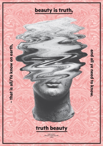
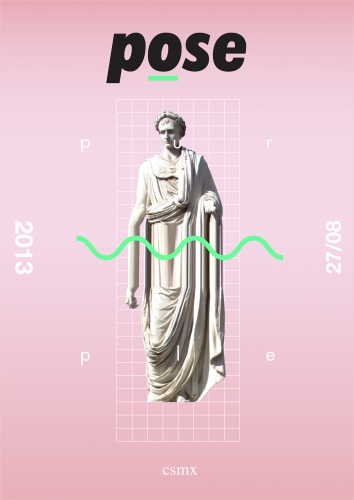
So
my research inspired me to create a range of graphic works which aim to educate
and enlighten people about themes that run within postmodern graphic design. I
wanted to do this in a very witty way. So I thought, why not create a booklet
which acts like a survival guide, a survival guide to the postmodern condition,
style, mind set and general aesthetic. I also found through research that many
argue that postmodernism is ‘dead’, so I wanted the survival guide to act
as a recap of the style and subtly hint at a style which is starting to become
widespread across the internet, which is the VaporWave Aesthetic. The survival
guide would actually work best in the 1980s, so when I was generating the
ideas, I was really designing for an audience from the past.