Thursday 18 February 2016

OUGD501 - Research - Internet Art Published

You might expect the catalogue for an internet art show to be an entirely digital affair, accessible via a QR code perhaps, or by using a VR set. But no matter how techy the work might be, audiences favour traditional mediums for their exhibition guides, so for its show Electronic Superhighway, the Whitechapel Gallery in London opted for a good old-fashioned book.
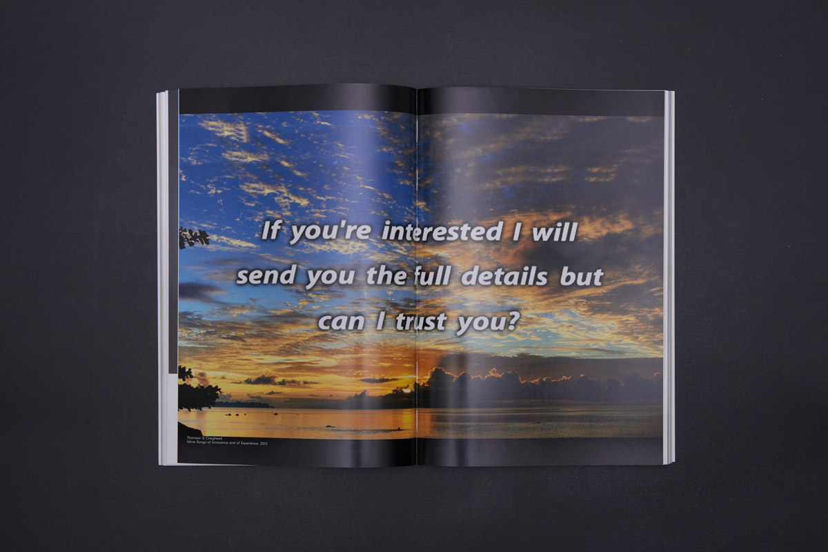
Created by design studio Julia, the catalogue does carry numerous references to the content of the show, however, from the fonts used to the finish of the cover. “The cover has a reflective finish that doesn’t reflect images, just light, separating it into channels (like a rainbow effect),” explains designer Hugo Timm. “This helps convey the idea of the book being about technology, with works that discuss our relationship to screens. It also means that the book will react differently to various environments.”

The design inside the catalogue also gives a nod to code, and to early html. “The layout references the way programmers write code, with lines indented by increasing amounts. This is a popular way to create hierarchy, nesting information into different levels,” continues Timm. “The grey paper and blue typography are a nod to the standard formatting of early html pages, where these colours would display as default in case another style was not specified. The chronological sequence of images is supported by a special-format timeline that highlights events related to the content of the exhibition.”
Finally, Julia deliberately chose a font that is native to computers and immediately signals ‘tech’ to readers. “The typeface is created from an algorithm-based language called Metafont (which is created online using Metaflop),” explains Timm. “It is native to computers and a rare example in the history of typography of a system that does not stem from an analog, calligraphic origin. By being the result of mathematical equations where different variables can be input (thickness, slant angle, width, height, corner radius, etc) there’s no absolute form, but a myriad of possible outputs. We represent this by mixing different variations into a same text block.”

Julia-Electronic_Superhighway-02

Julia-Electronic_Superhighway-19

Julia-Electronic_Superhighway-12

Julia-Electronic_Superhighway-11

Julia-Electronic_Superhighway-03


http://www.creativereview.co.uk/cr-blog/2016/february/turning-digital-into-analogue-julia-designs-the-catalogue-for-internet-art-show-electronic-superhighway/

http://www.itsnicethat.com/features/metahaven-thesprawl-110216


Wednesday 17 February 2016

OUGD501 - Practical Work - Initial Ideas

I commented in my conclusion that I feel that visual culture needs a resurgence of originality and authenticity to prevent a hyperreality or total simulacrum from manifesting itself. So, I thought it would be an interesting concept to suggest a solution to this condition through an art manifesto. The manifesto would then translate into a radical, avant-garde exhbition (all fictional of course). I decided that my practical work would be the exhibition branding, promotion and identity, with the manifesto being central to everything. 

I began by experimenting with poster designs as I viewed this as being the most important aspect to any exhibition branding/identity. I knew at this stage what the central theme of the exhibition will be: everything is centred around the new movement in visual culture that I am proposing titled 'Neuism'. Neuism aims to depart from current trends and exists as a solution/cure to the stagnancy currently being experienced in visual culture. Neuism burrows from modernist aesthetics and principles, so in my initial idea generation and experimentation, I used a range of fonts that are associated with Swiss Graphic design and modernism in general. This was a deliberate conceptual tactic. I played around with Helvetica and Akzidenz Grotesque, and the results were sort of predictable, rather uninspiring and not very radical or exciting. These initial ideas sort of remind me of things you would see on trendlist, which is exactly what I am NOT attempting to achieve. I was purely experimenting, and it was good to get it out of my system.

I was really just experimenting with copywritting and striking an effective and appropriate tone of voice. Below are some examples of my initial digital idea generation:


 I was consciously trying to make the designs ambiguous and mysterious as well as actively seeking to challenge peoples perceptions. I wanted to ask questions on the posters to make people really consider and take time out of their day to think deeply about what this exhibition is really all about. That explains a lot of my initial experimentation.


I then began introducing some colour. At this stage I wasn't really aware of how I could use colour to represent certain conceptual messages, I was just playing around to create aesthetically pleasing results. I was trying to make things bright and eye catching, because to me, good poster design usually involves some use of appropriate colour. I used gradients and other blocks of bright colour, which contrasted nicely with the black type. Again, I just felt as if I was producing work at this stage that was very 'trendy', superficial and sort of boring. It wasn't really communicating anything to do with the central themes of neuism or answering any of the questions/statements that I made in my conclusion. However, this was just the starting point of the design process, and all of these ideas were valid and useful in terms of development and experimentation.  


Wednesday 10 February 2016

OUGD501 - Research - Hyper-reality/Simulacrum in Contemporary Graphic Design

Poster design by Loes Claessens - In the designers own words: 
Hyperreality is an inability of consciousness to distinguish reality from a simulation of reality
A philosophy research about hyperreality based on Jean Baudrillard's treatise: Simulacra and Simulation. He believes hyperreality goes further than confusing or blending the 'real' with the symbol which represents it; it involves creating a symbol or set of signifiers which actually represent something that does not actually exist.

Loes_claessens_int_12
Loes-claessens-int-9

Loes_claessens_int_10

http://www.itsnicethat.com/articles/lukas-haider-egyd
https://www.creativereview.co.uk/cr-blog/2010/february/an-augmented-hyperreality/
https://blogs.commons.georgetown.edu/cctp-725-fall2013/2013/10/07/simulacra-hyperreality-and-photoshop-works/
https://books.google.co.uk/books?id=hfw3uJMT43EC&pg=PA8&lpg=PA8&dq=hyperreality+in+visual+culture&source=bl&ots=CS3Ywz0Odt&sig=JVDT5-7cxnCXfcqPb0p521V9p6Y&hl=en&sa=X&ved=0ahUKEwjlvsf4j5bKAhWKXRQKHeswB10Q6AEIPjAE#v=onepage&q=hyperreality%20in%20visual%20culture&f=false
https://books.google.co.uk/books?id=YZoJRCsePY0C&pg=PA40&lpg=PA40&dq=hyperreality+in+visual+culture&source=bl&ots=0JXNki8dW-&sig=0nTZK1FwtX68QgDz9rWNAl0fxV4&hl=en&sa=X&ved=0ahUKEwjlvsf4j5bKAhWKXRQKHeswB10Q6AEIUDAI#v=onepage&q=hyperreality%20in%20visual%20culture&f=false
https://books.google.co.uk/books?id=lcRvU3w33jsC&pg=PA145&lpg=PA145&dq=hyperreality+in+visual+culture&source=bl&ots=SqtN2Eq3rH&sig=Nj-a0zamgPRpy2jLbnABpbnd_zM&hl=en&sa=X&ved=0ahUKEwjlvsf4j5bKAhWKXRQKHeswB10Q6AEIQDAF#v=onepage&q=hyperreality%20in%20visual%20culture&f=false
http://library.nothingness.org/articles/SI/en/pub_contents/4
http://juerglehni.com