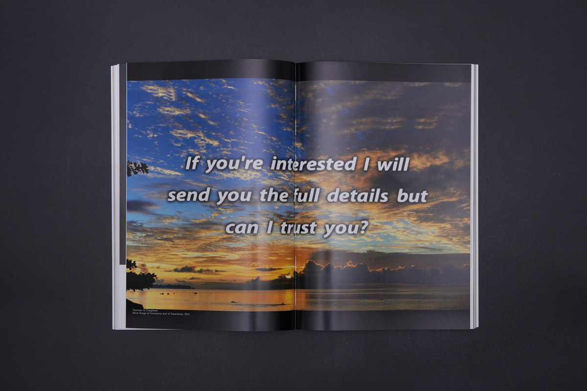
You might expect the catalogue for an internet art show
to be an entirely digital affair, accessible via a QR code perhaps, or by using
a VR set. But no matter how techy the work might be, audiences favour
traditional mediums for their exhibition guides, so for its show Electronic
Superhighway, the Whitechapel Gallery in London opted for a good old-fashioned
book.
Created by design studio Julia, the catalogue does carry
numerous references to the content of the show, however, from the fonts used to
the finish of the cover. “The cover has a reflective finish that doesn’t
reflect images, just light, separating it into channels (like a rainbow
effect),” explains designer Hugo Timm. “This helps convey the idea of the book
being about technology, with works that discuss our relationship to screens. It
also means that the book will react differently to various environments.”
The design inside the catalogue also gives a nod to code,
and to early html. “The layout references the way programmers write code, with
lines indented by increasing amounts. This is a popular way to create
hierarchy, nesting information into different levels,” continues Timm. “The
grey paper and blue typography are a nod to the standard formatting of early
html pages, where these colours would display as default in case another style
was not specified. The chronological sequence of images is supported by a
special-format timeline that highlights events related to the content of the
exhibition.”
Finally, Julia deliberately chose a font that is native to
computers and immediately signals ‘tech’ to readers. “The typeface is created
from an algorithm-based language called Metafont (which is created online using Metaflop),” explains Timm.
“It is native to computers and a rare example in the history of typography of a
system that does not stem from an analog, calligraphic origin. By being the
result of mathematical equations where different variables can be input (thickness,
slant angle, width, height, corner radius, etc) there’s no absolute form, but a
myriad of possible outputs. We represent this by mixing different variations
into a same text block.”


http://www.creativereview.co.uk/cr-blog/2016/february/turning-digital-into-analogue-julia-designs-the-catalogue-for-internet-art-show-electronic-superhighway/
http://www.itsnicethat.com/features/metahaven-thesprawl-110216

No comments:
Post a Comment