
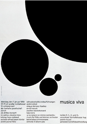
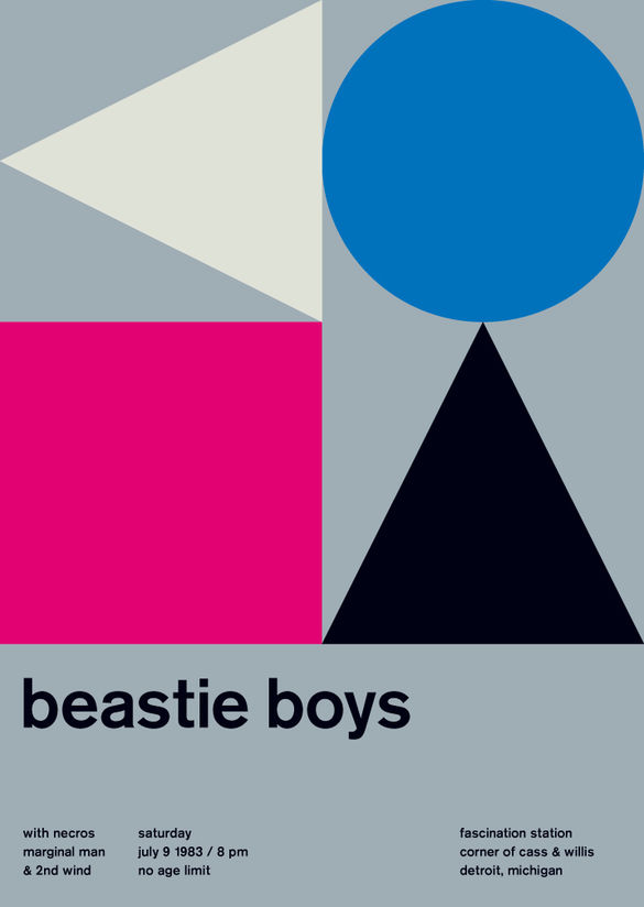
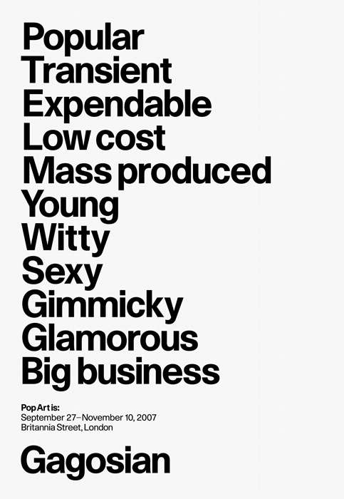
I did some secondary research using books but mainly the internet to gain insight into conventions of successful exhibition poster design and other collateral design. Initially, I thought that I wanted my branding/identity to feature a modernist aesthetic - this was a conceptual decision and I wanted to make links with modernism because that is what neuism is directly influenced by. So I looked at a lot of modernist poster design for initial influence and inspiration, which was beneficial.
A lot of modernist poster design for events is highly minimal and functional, characterised and dominated by strict grid usages, large areas of white space or flat colour, classic sans serif typefaces and sophisticated use of geometric shapes/forms. All of these principles are very useful when designing a poster for any context, but especially in this context.


http://www.amalieborghansen.com/graphic-design-manifestos-revisited
https://anamunizgraphicdesign.wordpress.com/2014/10/28/manifesto/
http://www.claireorrell.com/workout-1/
https://www.behance.net/search?field=36
No comments:
Post a Comment