
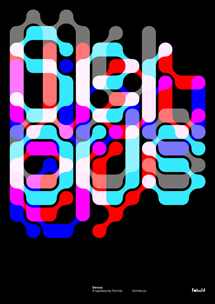
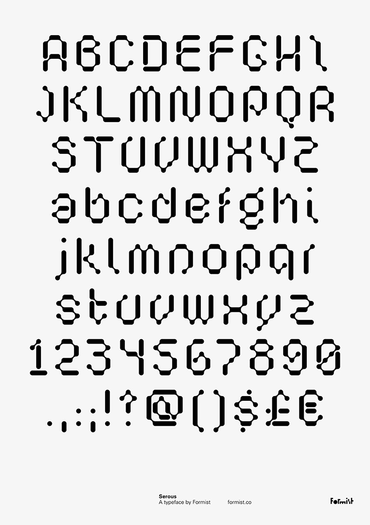
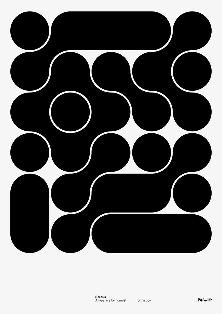
Their first poster in an ongoing series entitled ‘Poster One’, designed by Mark Gowing, is now available as a free download for Formist members. To register as their member and own this mind-blowing poster
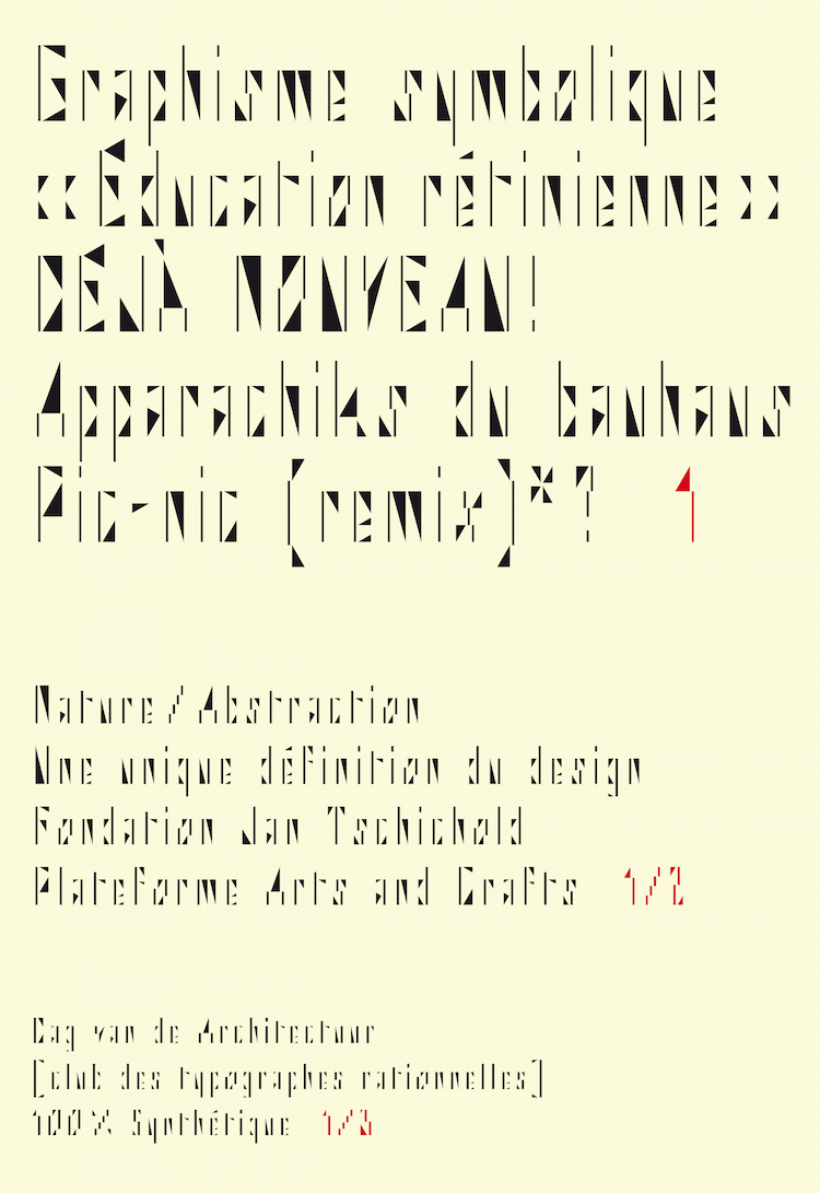
BB Bureau :: Side A
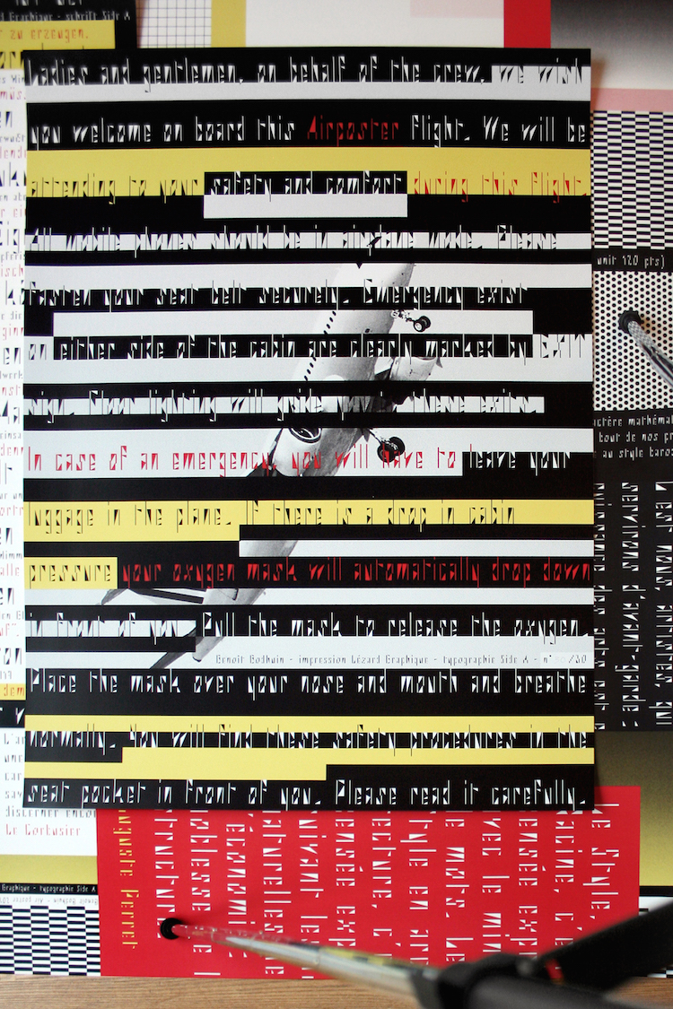
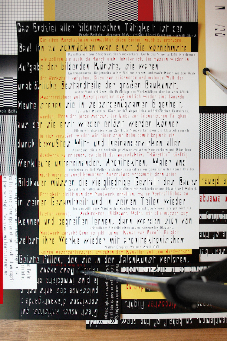
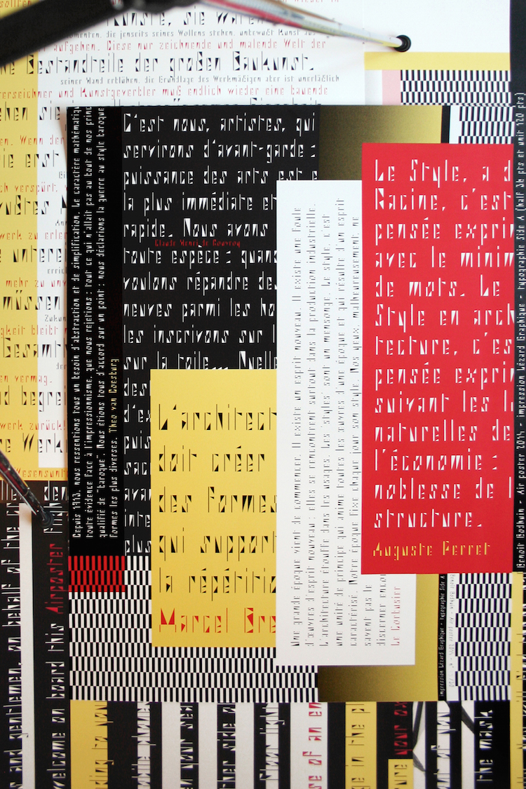
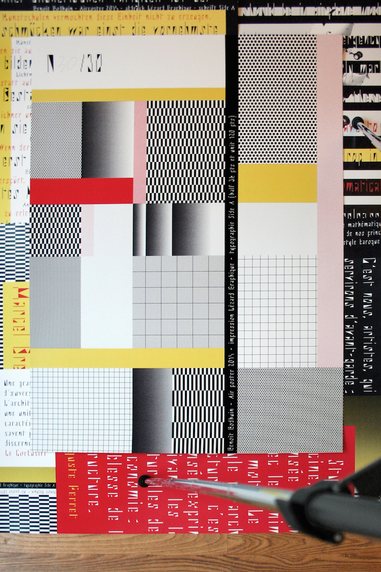
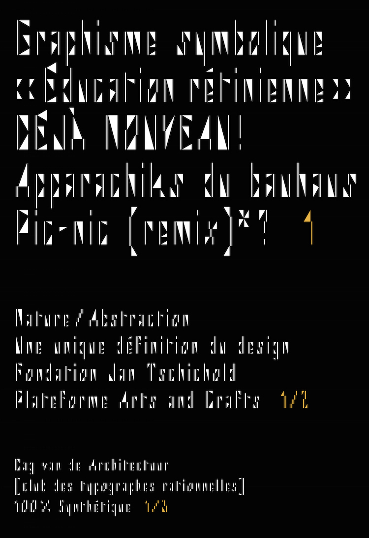
Type and graphic designer Benoît Bodhuin always produces work that is easily identifiable at a glance. Once again, his latest Bauhaus-inspired typeface called ‘Side A’ has achieved the goal through simplicity and character, utilising only grids, bars, and geometric shapes. By creating typefaces as an experiment, Bodhuin has managed to tear down the commercial barriers and produce type that is both unique and timeless. For this type edition, he has also created an accompanied set of three-colour posters, all screen-printed in black, yellow and red, to help promote the typeface.
No comments:
Post a Comment