Monday, 25 April 2016

OUGD501 - Module Evaluation

OUGD501 – Evaluation

I have very much enjoyed working on COP2 this year, I feel I now value the more academic structure of the Context of Practice module much more as it has given me opportunity to revisit the critical thinking and academic writing in new, more focused and refined contexts. I have found the COP2 module significantly more rewarding than the first year COP1 module, as I have been more actively engaged and focused with the area of research and inquiry. Choosing my own research focus made the process and response to the module far more informed and rewarding, and I especially enjoyed working on the practical aspect and tailoring it to my current design interests and concerns. COP2 has extended my knowledge of many significant movements that have impact contemporary visual culture, namely postmodernism. This area of research interests me greatly and I have been applying this inquiry across my other academic work within college and my personal endeavours outside of my education.

My research question built on an area of specific interest that I started to develop in my foundation year at Central Saint Martins. For my final project there, I investigate hypermedia’s and image saturated visual cultures and the impacts that they are having on wider creative practice. At that stage, I was really undertaking in depth contextual, academic research, all of my investigation was rooted in fine art practice. COP2 provided me with a platform to really delve deeper into related topics, exploring issues that I looked at very briefly in COP1. I was able to tailor my investigation to my current interests and concerns within graphic design, which I found really exciting. In level 04, I researched postmodernism in a very broad sense. I knew that I wanted to research further into this fascinating topic. I briefly touched on contemporary visual culture, looking at new wave aesthetics and underground movements such as post-internet art and VaporWave aesthetic, but I didn’t really feel satisfied with the level of analysis and research, so I decided to carry on down these lines of investigation for COP2. I looked into theories surrounding simulacrum and simulation last year, which was beneficial. These theories can be used to explain and understand current trends and attitudes within visual culture, so I saw it appropriate to explore them in a more critical, contextual way. Through reading important academic sources, including Baudriallard’s 1981 ‘Simulacra and Simulation’ and Jameson’s 1991 Postmodernism, or the Cultural Logic of Late Capitalism, I was able to gain a more intellectual insight into issues surrounding postmodernism and contemporary visual culture. My broad contextual research into these key theorists and varied visual research allowed me to develop a very strong essay structure. I found it easy to write a conclusion, but found it challenging to take the research topics forward to articulate them into a body of practical work.

I struggled for a long time to form synthesis between the very broad, abstract and quite intangible issues being discussed into a practical body of experimental visual work. I concluded in the essay that contemporary visual culture has become, for want of a better word, stagnant. I didn’t simply arrive at that conclusion based on personal views or attitudes. My conclusion was supported by key theoretical statements from poignant figures such as Baudrillard and Hutcheon, who were making observations about trends in visual culture in the 1970's and 80's. I found it fascinating that their investigations into this topic produced theories that seem to predict and foreshadow our current creative/visual culture. Importantly, I didn’t conclude that we have arrived at a state of pure simulacrum, nor have we entered into a total hyper-reality. The majority of commercial visual communication today is just that: commercial. Aesthetics here feel polished, sophisticated, but there are definite elements of expression and experimental attitudes that are prevalent in postmodern work that seem to have become popular, especially amongst graphic designers. What I found interesting was to look more closely at personal work produced by contemporary creative's, to see the wider impacts that they are having on visual culture. I concluded that visual culture has started to feel stagnant in the sense that things have been done before in terms of surfaces. It's as if designers are taking post-modernist principles and attitudes and amplifying them beyond recognition. Therefore, I realised that my practical work needed to attempt to make a comment on the state that I personally feel we are experiencing and potentially offer some hope for the future. The practical work in a sense, attempts to answer the issues highlighted in the essay, providing a solution to the bold conclusion that I came to. 

Overall, COP has rewarded me in a number of intellectual, academic, contextual, conceptual ways. This module has been rewarding in the sense that it has encouraged me to forge new connections between theoretical and creative practice within areas of visual communication that I am passionate about. COP 2 has ultimately allowed me to establish new links between the theory and practice of my personal and professional work. Developing a research topic I have been completely engaged with has resulted in a contextually relevant research essay that has then been extended with thorough, well informed synthesis into a body of contemporary practical work that I am very proud of.


OUGD501 - Practical - Design Boards


Sunday, 24 April 2016

OUGD501 - Practical Proposal - Neuism Manifesto

As visual culture pushes ever further into a ‘post-postmodern’ condition, the incestuous breeding of signs and symbols will inevitably continue to occur on larger scales, across large ranges of media, effecting larger amounts of people. Due to advances in technology and the continual shift of attitudes and preferences within the creative realms, we have arrived at a point in visual culture’s timeline that is highly intangible and difficult to define...

The renowned French sociologist, philosopher and cultural theorist, Jean Baudrillard concludes in his 1981 text ‘Simulacra and Simulation’ that “everywhere the Hyperrealism of simulation is translated by the hallucinatory resemblance of the real to itself”. Baudrillard made this rather radical observation in the later part of the 20th century, when mass media and more importantly, the Internet, had no influence over our creative industries. If he felt like that then, imagine how he would feel now!

Advancing trends in today’s ever changing creative plain and so called ‘visual culture’ increasingly demonstrate incessant desires to re-reference ‘texts’ from the past. It’s no shock that people are beginning to feel a sense of stagnancy, particularly in the fields of visual communication.

At the heart of most work that could be viewed as being postmodern are exciting, witty, playful, irreverent and parodic intentions. However, an increasing percentage of work produced today appears to have exhausted the once exciting avenues that the postmodern avant-garde offered society. 

This hopeless state of constant recycling and regurgitation of symbols and signs has become somewhat predictable in today’s hyper image-saturated environment. Very little feels genuinely original, honest or authentic anymore. Our obsession with technology, combined with the endless demands from our high speed society has produced a sense that everything has already been done, that every creative resource has already been exhausted. This can only be having a negative effect on our visual culture.

Our current attitudes and approaches to design thinking and making are not offering anything ‘new’ to a world with a insatiable thirst for fresh aesthetics, and these attitudes show no sign of disappearing any time soon.

This begs the question: What does the future hold for visual culture? Well, Neuism may hold the key to that very question…

Neuism [adjective]
Derived from the German word for ‘New’, a Neuism is a piece of work produced by a creative practitioner which has considered four fundamental pillars which are underpinned by key modernist and post-modernist principles, theories and ideologies.

 A Neuism is characterized as not existing before, featuring an aesthetic which is distinctly contemporary. Work that has been produced, introduced, or discovered recently or in the now or for the first time is considered a Neuism.

A MANIFESTO FOR THE AGE OF VISUAL STAGNANCY

Creative self expression is a fundamental part of contemporary visual culture, and it’s something that the postmodern avant-garde held close to its heart. Neuism recognizes this, but vitally  teaches creative practitioners to reconsider the functionality and simplicity promoted by the modernist movement of the early 20th century.

Neuism believes that a creative person must always have the right to total creative freedom but must always bear in mind the four pillars of Neuism:

1)         Neuism doesn’t believe in ‘art’ for ‘art’s sake’, nor does it value design for design’s sake. A neuism never compromises communication for aesthetics

2)         Visual culture must always look forward to the issues and problems that will need to be solved. Neuism is always facing ahead and tries to burrow as little as it can from the past

3)         Visual communication should aim to communicate with EVERYONE, not just those who are aware of contemporary trends and aesthetics. Neuism is inclusive of all and doesn’t conform to trends

4) Neuism promotes authenticity and originality, ultimately allowing individual preferences and concerns to underpin the work, rather than constantly catering towards other’s tastes
Neuism is not a totalitarian vision for society. Rather, it exists simply to challenge and agitate the condition we are presently experiencing. Neuism aims to alleviate the boredom experienced by many consumers of contemporary visual culture, hoping to ignite new passion in the collective creative consciousness, encouraging the re-emergence of pure originality and individualism in the creative environment.

At its core, Neuism teaches us to try to adopt an ongoing conscious process of merging contemporary attitudes with key principles from modernisms’ past. Neuism accepts the fact the humans very much need nostalgia in their lives, but this nostalgia does not need to define the present. Simultaneously, it values the self expression and freedom that postmodernism promoted, but doesn’t believe in taking things to the extreme. Neuism balances us.

It applies to everyone and anyone who wants to embody it.


OUGD501 - Practical - Primary Research - Exhibition Branding

The best type of primary research that I could undertake was to go and actually visit a number of current exhibitions happening to assess the effectiveness of the exhibition branding and to obviously take direct inspiration in terms of aesthetic and general design treatment.

I ventured into Leeds city centre on the look out for any type of creative exhibition that I could find. I wasn't being picky in terms of the shows that I was visiting, I didn't see the point in limiting myself in that context. The first gallery I visited was the Henry Moore institute, which is known for having cutting edge, contemporary shows on throughout the year. The current show, titled 'Lesson's in Sculpture' was no disappointment in terms of the exhibition branding and collateral. It wasn't until I got back from visiting the exhibition that I realised that the exact same typeface that I have been experimenting with had been used throughout the identity of the show. This made me pleased, because it reassured to me that my branding was appropriate and would integrate well within the contemporary exhibition environment.

There were several things that I really appreciated about the branding/identity for this particular show. Firstly, on the outside of the building, large, highly legible vinyl stickers had been employed to advertise the show to the passing general public outside on the busy street. Vinyl stickers are not only a great way of creating effective way finding, but they are excellent tools for promotion/advertisement.


Inside the building, further vinyl had been used to signpost the show and give the audience a brief description of what to expect inside the gallery space. I felt this was a nice touch, and I have seen this tactic used throughout a number of contemporary exhibitions. I find it much more effective that displaying information about the show on a piece of paper or in a booklet. Seeing these effective vinyl stickers in context inspired me to mock some up for my own exhibition branding. 


At the front desk of the gallery, I found some useful and well designed gallery brochures and leaflets. These were consistently designed in line with the rest of the branding/identity for the current exhibition. The same typeface as the vinyl sticker has been used throughout the brochure which is effective. The layout is extremely simplistic and minimalistic, allowing space for the information to breath and for the images to really shine and dominate the spreads. I am going to create a very small, fold out A4 brochure for my exhibition branding which will give detail to the concept and content of the show. It will not need to be as extensive as some of the brochures I came across, but it will pull inspiration and influence from some of the best designed examples I found. 


An A5 double sided flyer printed on heavy stock. These are nice touches, because they give the audience just enough information about the gallery/show to get them intrigued without bombarding them with visual content. They also double up as small posters which is a great bit of design thinking.


The second gallery I visited was at Munro House. This small gallery hosts regular exhibitions which celebrate local talent from Leeds and the surrounding areas. The show I went to see was titled: 'Leeds through a lens - revisited'. It was a photography exhibition, so even before getting there I had certain expectations concerning the branding/identity and overall aesthetic of the show, because I have been to my fair share of photographic exhibitions. Similarly to the Henry Moore, vinyl stickers had been used throughout the inside and outside of the building to indicate the show. I think that these particular vinyl stickers are very striking and make a great first impact when approaching Munro House. Other than the vinyl, there was very little other branding on show. I became aware of this show due to social media, I saw it advertised on Facebook. On the internet, there were banners and e-flyers promoting the show which were interesting, but I didn't come across any posters or flyers around town, which was a little disappointing. I would have liked to have seen some more exciting, vibrant promotion printed collateral.


Other branding for the Gallery at Munro House:


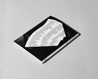
Another place which usually has great exhibition branding is the Tetley Gallery. Back in March, I attended the International Artists' Book Fair which had some excellent branding. Very clean and functional poster design, featuring Gill Sans and other highly legible sans serifs. I also really like the colour choices that the Tetley use, not too bright or bold, quite subtle and paired back.


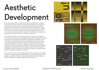
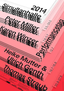
An upcoming show at the Tetley: This poster design is pretty 'trendy' and contemporary. The blurred, scanned type makes it feel like it would potentially feature on trendlist, which isn't necessarily a bad thing, but I don't want to achieve an aesthetic like this in my branding. In fact, I want to get as far away as possible from anything that could in the slightest feature on trendlist. Seeing this poster has motivated me to achieve a very fresh, clean functional aesthetic. After all, my practical works' main intention is to promote a new vision for visual culture and try to lift it out of the state it is currently in.


OUGD501 - Practical - Final Outcome - Exhibition Branding/Identity Proposal

My practical body of work is centred around branding and identity, an area of visual communication that I am very much interested in and passionate about. This is a part of graphic design practice that I could easily see myself entering into one day, and I have enjoyed producing and experimenting with various aesthetics for COP2. I produce all of the branding and identity for this fictional exhibition titled: "NEUISM: A manifesto for an age of visual stagnancy" - using a range of programmes from the Adobe Suite. I used Illustrator and InDesign the most with a lot of support from Photoshop.

As all of the work I produced is digital, I thought it would be appropriate to mock up all of the collateral to a very professional, premium standard, using the best template and free mockup artwork that I could get my hands on. Mocks up are great as they save on materials including ink and paper and money. In commercial contexts, mock-ups are efficient and celebrated as great ways of developing a conceptual idea from start to realisation. They are invaluable tools, because they mean you can assess and critique a piece of work before sending it to print on a commercial scale, which is what would happen if this were to be a real life exhibition branding project.

Once I had finalised all of the designs for the branding/identity, I compiled all of the work into a formal presentation which would be used to pitch the entire concept of the exhibition to the prospecting art galleries board of directors etc. I decided to make the presentation because I needed a formal context to present all of the work that I had created for COP. In a real world context, presentations like these would most like be delivered or sent to an art gallery months before the exhibition would get the go ahead, therefore I tried to make it as authentic as I could.

Below are a selection of key slides from the presentation:


Saturday, 23 April 2016

OUGD501 - Practical - Research - Art Manifestos

An art manifesto is a public declaration of the intentions, motives, or views of an artist or artistic movement. Manifestos are a standard feature of the various movements in the modernist avant-garde and are still written today.

Art manifestos are sometimes in their rhetoric intended for shock value, to achieve a revolutionary effect. They often address wider issues, such as the political system. Typical themes are the need for revolution, freedom (of expression) and the implied or overtly stated superiority of the writers over the status-quo. The manifesto gives a means of expressing, publicising and recording ideas for the artist or art group—even if only one or two people write the words, it is mostly still attributed to the group name.

I am going to propose a manifesto for a new movement within visual culture for my practical body of work for COP2. I see this as being the best way of creating synthesis between the issues raised in my essay and the quite dramatic conclusion that I came to. I concluded that visual culture has arrived at a crossroads in its timeline. We have created a sense of stagnancy in creative society because we continue to hopelessly and aimlessly recycle and regurgitate aesthetic surfaces from the past. I concluded that in order to move forward out of this state of stagnancy that we have put ourselves in, something big needs to happen. Visual culture needs to experience a re-birth in order to evolve and return to a state of pure authenticity, originality and inspiration.

Manifestos for movements such as Modernism, Futurism, Dadaism and Fluxus all existed to do just that; to push the contemporary visual culture of the specific time out of the state that they felt was unhealthy and idle. Many avant-garde creative people benefited from these manifestos for new movements, styles and aesthetics and I believe that my generation of creatives’ in particular would benefit highly from a new manifesto proposal. That is the driving force and reasoning behind my practical investigation for COP2.

There is a manifesto in particular which I am concerned with. It is known as the Fluxus manifesto and I believe it will provide me with a lot of inspiration for my practical work. It is a highly dramatic and shocking manifesto which had very strong views and opinions. I don’t necessarily want my manifesto to have such high shock value, if anything I want it to feel approachable and non-condescending.

Written by George Maciunas this short hand-printed document consists of three paragraphs interspersed with collage elements from dictionary definitions related to "flux". It is written in lower case, with upper case for certain key phrases, some underlined. Its first paragraph is:
Purge the world of bourgeois sickness, "intellectual", professional and commercialized culture, purge the world of dead art, imitation, artificial art, abstract art, illusionistic art, mathematical art, — purge the world of "Europanism"!

It advocates revolution, "living art, anti-art" and "non art reality to be grasped by all peoples, not only critics, dilettantes and professionals."

Synopsis

Beginnings:Fluxus was an avant-garde art movement that emerged in the late 1950s as a group of artists who had become disenchanted with the elitist attitude they perceived in the art world at the time. These artists looked to Futurists and Dadaists for inspiration, focusing especially on performance aspects of the movements. The Dadaist use of humor in art was also definitive in the formation of the Fluxus ethos. The two most dominant forces on Fluxus artists were Marcel Duchamp and John Cage, who championed the use of everyday objects and the element of chance in art, which became the fundamental attitude and practice of all Fluxus artists.

The early phase of Fluxus, often called Proto-Fluxus, began in 1959 when a group of artists who had met in Cage's class at The New School in New York banded together to form the New York Audio Visual Group. This group provided venues for experimental and performance art. Al Hansen, Dick Higgins and Jackson Mac Low were associated with this group, and would all be part of Fluxus. George Maciunas, often credited as the driving force behind what is otherwise a rather inchoate movement, would often be in the audience at the performance venues. Maciunas is credited with naming the group Fluxus, which means "to flow." The first Fluxus event was organized by Maciunas at the AG Gallery in New York in 1961, where he was co-owner. The event was called Bread & AG, and consisted of readings by poet Frank Kuenstler. That was the first in a series of performances that were staged that year at AG Gallery.

Concepts and Styles:George Maciunas had strong opinions he frequently and forcefully expressed, often leading to contention between himself and other Fluxus artists. Maciunas articulated his beliefs in Fluxus manifestos, one being that fine art, "at least its institutional forms," should be, "totally eliminated." Other Fluxus artists such as Jackson Mac Low did not agree, once writing, "...I would not want to eliminate museums (I like museums)."

Maciunas was a bit of a volatile leader; he would indiscriminately expel individuals from Fluxus according to his whims and had no qualms about dropping artists for the most petty of disagreements. In 1963, Maciunas removed Jackson Mac Low from the Fluxus group, and the following year, expelled Dick Higgins, Alison Knowles, and Nam June Paik.

Essentially, while a group of artists who were all considered Fluxus existed, they did not all agree to the same ideals and each viewed Fluxus in a different way. As filmmaker George Brecht put it, "In Fluxus there has never been any attempt to agree on aims or methods; individuals with something unnameable in common have simply coalesced to publish and perform their work."
Fluxus events included audience participation as a way of involving the public in the making of art. Such was the 1970 Fluxfest Presentation of John Lennon and Yoko Ono, where Maciunas made paper masks of John Lennon and Yoko Ono for the audience to wear. With this act, Maciunas shifted the role of the viewer from observer to performer .The use of the audience as the focus of the piece was a logical extension of his idea that, "anything can substitute for art and anyone can do it...the value of art-amusement must be lowered by making it unlimited, mass-produced, obtainable by all and eventually produced by all."

Although Fluxus is mainly known for performances and organized events, Fluxus artists also created more plastic forms of art, such as boxes filled with various items (often called Fluxkits), prints, and Fluxus films. Sometimes these works were not signed, as per Maciunas' belief that the ego of the artist should be removed from the artwork, meaning all pieces should be signed as simply, "Fluxus."

OUGD501 - Practical Work - Final Realized Manifesto

The central component of my practical body of experimental work is the manifesto for Neuism. It acts as a subtle proposal, suggesting ways in which we can learn from the past in order to move forward. It explains the reasons why a 'cure' is needed.

Neuism. A manifesto to challenge the age of visual stagnancy could provide us with the answer to the condition we are presently experiencing. Neuism aims to alleviate the boredom experienced by many consumers of contemporary visual culture, igniting new passion and encouraging the emergence of pure originality.

At its core, Neuism teaches creative practitioners from all backgrounds and disciplines to try to adopt an ongoing approach/process of merging contemporary attitudes with key principles from modernisms’ past. Neuism accepts the fact the humans very much need nostalgia in their lives, but this nostalgia for aesthetics from the past does not need to define the present. It values the self expression and freedom that postmodernism promotes, but it also values the functionality and rigidity of modernism. Below is a digital version of the final written and formatted manifesto for Neuism:

OUGD501 - Research - Examples Simulation and Simulacra in Contemporary Visual Culture

The key theorists which I have based all of my contextual and conceptual research on for the essay, Baudrillard and Jameson, both agree that the utilisation of devices such as imitation, duplication and pastiche contribute to the implosion of meaning, the loss of referentials, and ultimately the manifestation of hyperreality. For hundreds of years, new visual styles have infiltrated the collective consciousness of the creative industries through aesthetic upheavals lead by radical creative thinkers and makers. In order to progress from the place that it currently resides, visual culture must experience a rebirth to prevent itself from becoming its own total simulacrum, devoid of definitive style and originality.

There is a current trend in some visual communication (graphic design and illustration) to make blatant and deliberate references to contemporary and past 'cultural items'. These cultural items include computer software, such as out dated web browsers and word editing programmes, mouse and pointer icons, computers themselves, old fashioned digital typefaces, patterns associated with the 80s and 90s and so on. These are obvious manifestations of pastiche, parody and simulation. 

The French sociologist, philosopher and cultural theorist, Jean Baudrillard concludes in his 1981 text ‘Simulacra and Simulation’ that “everywhere the Hyperrealism of simulation is translated by the hallucinatory resemblance of the real to itself”. Baudrillard made this rather radical observation in the later part of the 20th century, when mass media and more importantly, the Internet, had no influence over our creative industries. If he was feeling that way then and making those specific comments/predictions, I struggle to imagine how he would feel today if he were still alive. 

I am an avid user of Tumblr and Pinterest, and throughout the course I have been saving a bank of visual work that I have come across online which to me, proves that are beginning to arrive at a stage of simulacrum within visual culture. I have come across a number of very interesting pieces of work which contain blatant use of pastiche and parody as well as sophisticated representations of simulations such as digital word documents and cursors from computer monitors. Below are a selection of the best images I came across, which directly link to the issues discussed in my COP2 essay: