Monday, 28 November 2016

OUGD601 - Research - BB-Bureau

Produced a typeface directly inspired by the abstract minimalism of Bauhaus experimental typography. The series of posters produced represent sections of the manifesto for the Bauhaus envisioned by founder Walter Gropius

'Experimental spiky type' - 2014 - represents a desire to abstract and reduce letter forms down to their most minimal state, for  me this typeface embodies the ideals and principles of the Bauhaus in a uniquely contemporary way. This typeface also explores notions of legibility and functionality, representing postmodernist concerns. To me, the designers interests and mentality oscillate between modernist and postmodernist, sitting an intersection between the the two schools. 


Bauhaus Quotes


Bauhaus manifesto


The typeface was then translated into a set of wallpaper designs, which have a distinctly deconstructionist aesthetic to them. They are visually chaotic yet highly intriguing. The designs manipulate image and type to create a surface which is difficult to interpret. There is little point to the wallpaper but this is exactly the point. It is purely experimental and embodies postmodernist attitudes and principles.   


Wednesday, 23 November 2016

OUGD601 - 4th Tutorial Notes

In today's tutorial, the structure of my essay was assessed again, in order to fine tune it and make it easier to undertake. We agreed that the suggested structure of having three to four large chapters would not be conducive to my research and lines of inquiry, and it would make sense to break down the chapters into smaller bits, anabling a more logical flow and critical analysis to take place. 

Intro
Two faces -Terms to describe the present - difficulties in articulating what the contemporary life actually is? Examples - embody these questionsApparent visual devices - ironic, truth to materials?Both interpretations of the work are convincing , then is contemporary GD a dialctic between the two?

ABSTRACTION - negation  (ornamentation/representation - removes cultural specificity) PM (anti-universality/subject/order/universal communcation) contemporary
ROLE DESIGNER + WORK
COMMUNICATION - legibilty, sequence, universal typeface - who was for it for?
POLITICS - DADA (the state, War, society, proletariat/bourgeious, 
INSTITUTION - Avant-garde, Metahaven (public) how is contemporary graphic design supported? Where can experimental work exist?
AUTHOR - hand of designer, Rand, 
TECHNOLOGY - machine (celebrate, access), PM (accessibility, critical of...), 
ORIGINALITY - Jameson ('voice'), parody
FUNCTION - Metahaven (public), Baudrillard (simulacra)
SPECULATIONSpeculative - Modernism - Utopia, Avant-garde - producing an imagined future within the presentPostmodernism - look to past - why?
Questions that are still active and unresolved?Impact on technology on communicationRole of graphic design speculative - shared sense of purposeSurface -Client

Different ways to describe contemporary Graphic Design:
PostpostmodernismDigimodernismMetamodernismHauntologyDesign-culture-graphicsCritical graphic designSpeculative graphic design

Monday, 21 November 2016

OUGD601 - Chapter 1 Draft Feedback


  • Avoid writing in a linear or chronological fashion - the account of modernism so far is just a linear history - it lacks an argument, very descriptive
  • You need to refer to your sources all the time - where do the accounts you are giving come from, there are hardly any references?
  • You need to triangulate around conflicting accounts of modernism Political (Constructivism) / Neutral (DADA? others? Bauhaus?)
  • Role of abstraction - negation (Swiss/I Style vs. DADA or photomontage/others?)
  • Design as prescription (to fix the present) as opposed to proposition (depict a new future with the present) 
  • Role of designer (neutral - Brockmann - why should they be neutral? what are the benefits?; contrast with DADA?)
  • Modernist space is homogeneous
  • Modernism has a belief in progress (DADA? did they believe this? Are they not closer to postmodern in their use of critique?)
Think that you need to think of a different way to order the chapters to avoid this. Have a think about this and see me tomorrow so we can go over it.

Would it be possible contrast the features you are describing within modernism with how they were challenged within postmodernism? Or do you want to outline these structures within Modernism and outline their contemporary relevance or not? 


How will you end the chapter - Do you want to list those structures that are still relevant today and so haven’t been addressed throughly through postmodernism. That way you can start building your dialectic - and build a developing argument in the next chapter about how postmodernism attempted to address these questions but didn’t completely (hence still being relevant today).


At the minute it isn’t a critical essay - there are parts towards the end, but these would be better interspersed earlier to contrast with what you have written. You need use all the stuff we have discussed as this information is there to address your essay question:

  • Can you contrast the availability of public support structures for experimental work today within modernism/Constructivism (Metahaven).
  • Modernist design as ‘prescription’ (from the All Possible Futures catalogue)
  • Changing idea of ‘abstraction’ -within modernism it is an act of negation, today this is not the case (Erik Carter talk)
  • Which of these modernist ideas have come back within the post-postmodern?
  • Form of design: Proposition or prescription?

If the first chapter provides within the conclusion the structures found within Modernism which are still relevant in your proposed dialectic today, does chapter 2 do the same for postmodernism?
If so, you should argue from different interpretations of Modernism and Postmodernism (compared to today) and not just outline a linear history.


       Write paragraphs that focus on specific points - that way you can argue around the issue

Thursday, 17 November 2016

OUGD601 - Dissertation Research - Fabian Fohrer

Order & Disorder:

The work of Fabian Fohrer is intriguing, as it appears to sit at the intersection of modernism and postmodernism in the sense that it burrows and intertwines characteristics from the two schools of thought. His typographic decisions appear to be informed by modernism, but his treatment of the type, the general layouts and compositions and overall aesthetic seem to embody postmodernist attitudes.

He appear to acknowledge the rules, but proceeds to disregard them anyway. Usually, a visual 'mistake' is taken to be a bad thing and it actively left out of the design. Deconstructivist design actively includes these 'mistakes', switching the overall focus of the design. The imperative here is to feel, rather than to simply serve a specific function. 

Fabian_fohrer_its_nice_that_8

Fabian_fohrer_its_nice_that_7

Fabian_fohrer_its_nice_that_ovo

Fabian_fohrer_its_nice_that_website

OUGD601 - Dissertation Research - Koln Studio Madrid

I have emailed this studio with the hopes of interviewing them. I decided to get in contact with them as their work is current, and I suppose rather contemporary. It's evident that both modernist and post-structuralist principles have influence the aesthetic of their portfolio. Their work appears to straddle the line between the two schools of thought, essentially a contemporary condition.

Hopefully I get a reply, it would be illuminating to see what they make of modernism and postmodernism and also find out about their influences and general approach to design, especially as they are based in Spain.


Retina_03_copy


Koln1

Koln3

OUGD601 - Dissertation Research - Ben DuVall

I have been aware of Ben DuVall for some time now, but it wasn't until I began to undertake research for COP3 that I realised the significance of his work. His work explores issues of contemporary design practice and its surrounding visual culture. To me, his work is critical in the sense it probes us to think about contemporary design culture in a way that is not too overwhelmingly difficult to understand.

I decided to purchase a copy of his book 'New Modernisms', as it looks as if it will provide me with some excellent current commentary/insight on issues that I am exploring in my dissertation. I am currently waiting for it to be delivered but I am very much looking forward to delving into it. 


Ben's portfolio website is significant to me. At the top left hand corner of the page, there is a drop down menu with several options. You have Era/State, Political/Economic, Motivation/Medium, Index/Info. His work is movable, and you can 'sort' it into the various categories provided on the drop down menu. I find this feature highly intelligent and also irreverent, qualities I associate with critical design practice. 


Tuesday, 15 November 2016

OUGD601 - 3rd Tutorial Notes

Ben suggested I get in contact with more practitioners/designers/critical thinkers to broaden my scope and expand my knowledge on existing contemporary issues.

I have already heard back from three designers and I am going to ask them to pass on their questions to their colleagues, friends and other contemporaries in order to gain as many insights as possible in a short timescale.

People I plan on contacting over the coming days to begin some dialogue:

- Zak Kyes
- Gregory Ambos
- Metahaven
- Sara De Bondt
- Abake
- Experimental Jetset
- Katherine McCoy
- Jonathan Barnbrook
- Ellen Lupton
- Linda Hutcheon
- Eric Hu

I have also decided to delve through the archives of Emigre magazine in order to find other people that I could contact in regards to my research topic. Many essays and articles from this magazine were critical of design being produced at the time (late 80s and throughout the 90s). It would be interesting to gain their insight in a contemporary context.

OUGD601 - Updated Essay Plan

Chapter 1 – Assessing the Structures of Modernism in Graphic Design

  • Introduce the Arrival of Modernism & Postmodernism in Visual Communication
  • Evaluate key areas:
  • Devices & Visual language – the grid, white space, flat planes, minimal abstraction, geometric forms, universal typefaces, universal signs and formats
  • Role of the designer – the hand of the designer should not been seen and the voice not heard in the work – to communicate information clearly, for the form to follow function and the message to be delivered as effortlessly as possible
  • Social function – to offer a universal solution to society through functional design
  • Authorship – this was a foreign concept to modernist graphic designers
  • Context of the work – early part of the 20th century, visions of abandoning ornamentation and decoration which were popular throughout the 19th century, new emerging technologies and industrialised communities became the motivation behind the aesthetic and ideologies
  • Influence of technology – development of photography had a massive impact
  • The success and the downfall – became hugely popular in Europe very quickly, spread to USA – downfall came after the 50’s and 60’s when the world became obsessed with consumer and popular culture, something the modernists fought against – this gave way to postmodern critique of imposing modernist structures
  • View it as a critical devise as opposed to a stylistic movement
  •  Explore why it became so popular on an international scale
  • The presence of a universal language seemed appropriate at the time
  • Compare and contrast two different manifestations of modernism:
  • DADA – an authentically avant-garde manifestation (a reaction to the absurdity of WW1)
  • German & Swiss International Style (inspired by the machine, industrialisation and a utopian view for the future)
  • Conclude: Is modernism a critical movement or a purely stylistic, aesthetic one?

-           
Chapter 2 – Examine Postmodernism in Relation to Graphic Design
  • Introduce the arrival of Postmodernism: Key figures to compare and contrast – Derrida’s theory of Deconstruction with Foucault, Jameson’s theories on postmodernism with Baudrillard views on simulacra and simulation, Poyner & Lupton – critique their interpretations of the term and main ideas
  •  
  •  Key practitioners & institutions to discuss: Kathrine McCoy, Cranbrook, Emigre, David Carson, Neville Brody, Jonathan Barnbrook
  •  
  • Devices & Visual language – pastiche, parody, irony, duplication, abstraction, subversion, burrowing from the past, implosion of meaning, deconstructing values and ideals
  • Social function – to expose the flaws in structuralist thought, there are no absolute truths,
  • Role of the designer – to aggravate a reaction in the audience/consumer of the work, to communicate emotion in the visual elements rather than pure functionality
  •  Social function – to reflect the world as it really is: chaotic, re-introduce ornamentation and decoration, to make the voice of the designer heard, self expression and playfulness 
  • Authorship – the voice of the designer is at the forefront of the work, experimental work becomes popular, critical and speculative practice has its roots here
  • Context of the work – the world is becoming increasingly interconnected, the mixing of codes becomes inevitable
  • Influence of technology – the desktop computer spreads across the world, facilitating easy access to design tools to groups of people who perhaps didn’t have an existing background in design
  • The success and the downfall – Swiss punks such as Wolfgang Weingart began experimenting in ‘postmodern’ ways as far back as the 60’s, but never envisioned the experimentation becoming a stylistic movement as it later became. The visual language and general style of authentically anarchist designers such as Jamie Reid and David Carson became styles adopted by large groups of makers internationally – this was perhaps the downfall, as the rebellion became com-modified – when a subculture becomes the mainstream, it becomes more or less redundant
  • Conclude: Did postmodernism actually ever have an effect on GD? Or Is post-structuralist the more appropriate, effective term to use to describe this epoch?
  • Conclude whether modernity was ever actually left behind? Did it ever really die out, or has everything since the arrival of ‘postmodernism’ been an extension of modernist ideology, a constant reassessment of it? To think about the future is to be modern and a lot of graphic design nowadays seems to think about the present and burrow from the past, which is essentially postmodern.
Chapter 3 – Analyse the Current State of Design Culture (Primary Research Discussion)
  • Discuss the evolution of the ‘digital era’ (1984 to present) – evaluating its inappropriateness and inaccuracy as an all-encompassing term
  • Discuss the prominence of critical modes of work in contemporary GD culture, originating in the 90's and gathering in pace currently
  • Here, a discussion of key pieces of design work will take place, analysing their devices and background
  • Analyse the term ‘contemporary’, and whether or not it is relevant to our current condition or even appropriate to label work as being contemporary?


OUGD601 - Dissertation Research - Albert Exergain

There are clear manifestations of modernist principles within these poster designs. Minimalist geometric abstraction, limited use of flat colours, large areas of space between type and illustration elements (breathing space) and use of highly legible sans serifs. The designer has evidently been influenced or inspired by the International Style and American Modernism prevalent in the 1950's and 60s. Muller-Brockmann, Saul Bass and Paul Rand's aesthetics are reminiscent here, demonstrating the longevity and lasting influence of Modernism. 

The designer has made the conscious decision to apply techniques and approach from a movement born in the early 20th century and apply them to contemporary contexts. It's plain to see that Modenrism is still relevant and appropriate to current day audiences, in the eyes of Albert Exergain. 

Image result for albert exergian

Image result for albert exergian

Image result for albert exergian

Image result for albert exergian

Monday, 14 November 2016

OUGD601 - Dissertation Research - Swiss Poster Generator

I came across a very interesting website today whilst research for my dissertation, which generates 'Swiss Style' posters in a matter of seconds. The application is made by Ben DuVall and his brother, both American based designers/critics. 

The site explores the nexus of art and technology, modernism and post-modernism in the era of desktop publishing. The Swiss poster can be considered the height of precision in graphic design. In many ways, the computer has eliminated the need for human precision by reducing information down to bytes and pixels.

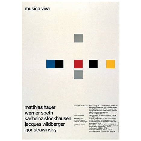
The aim of the site is to generate simple posters which burrow from the International Swiss Style, a movement intrinsically linked with Modernism. Mid-20th century Swiss posters are revered for their clean and modern composition and typography, qualities which seem to be less prevalent in contemporary design culture. The template for the app was based on posters by Swiss designer Josef Müller-Brockmann, such as the one below:

Swiss Poster Generator by Ben and Clark Du Vall


I generated a number of designs through the app and compiled them into GIFs to demonstrate the lack of thought/effort required in making a design which efficiently communicates a message. 

What I find entertaining about this website is how it has taken a movement which took years to manifest and establish itself within the global design community, and reduced it to its absolute bare components, subsequently turning it into an accessible tool for anyone to use. Modernist graphic design has many different principles, however, this website restricts it to just two: use of Helvetica (timeless sans serif font) and an area with minimalist geometric shapes filled with flat colours. 

This website is a critical piece of work, as it is asking a number of questions concerning the importance of modernism and its relevance to contemporary graphic design practice. Really intriguing stuff.


Thursday, 10 November 2016

OUGD601 - Primary Research - Contacting Vanja Golubovic

Today I sent out my first email to a 'contemporary designer' in the hopes that they will respond to some questions that I have devised for them. I contacted Vanja Golubovic. 

The email was as follows:


Hello,

My name is Cameron Wolfe. I’m currently in my final year studying Graphic Design at Leeds College of Art, UK.
I came across your work whilst researching for my thesis project and thought it would be valuable to get in contact. Your poster designs for Tresor caught my eye in particular whilst visiting Berlin earlier this year. 

My research project is focused on the current condition of graphic design culture, and since you are a contemporary designer, I thought it would interesting to get your insight on this topic

I am investigating the discourse of design’s short history, examining the impact that various social, political and technological shifts have had on our practice worldwide throughout the decades.

It would mean a lot if I could get your opinions on these current issues and I’d also be intrigued to find out about 
your personal design process.

If you have a spare moment, please let me know and I will send over the questions.

look forward to hearing from you soon!


All the best,

Cameron

*Awaiting a response*

Saturday, 5 November 2016

OUGD601 - Revised Planning for Dissertation

I decided it would be beneifical to bullet point the areas in which my dissertation will  in order to get more organised. This is basically an up-to-date, consolodated/sicint essay plan:

Points to Cover

Chapter 1- Theories and Contexts
  • The arrival of modernism in graphic design – cover structuralism
  • Its key figures and notable examples of work
  • The supposed departure of modernism and the birth of postmodernism – cover post-structuralism, a critique of modernism or an extension of its ideas?
  • Key protagonists and notable examples of work
  • Introduce the idea that these movements can be considered as binary
  • Explore the deconstructivist movement which appeared from postmodernism
  • Outline the fact that there is an apparent lack of a defining term for the current moment? Comment on why this may be the case


Chapter 2 – The Role of Graphic Design
  • Explore the role of the designer – if work and movements are to be deconstructed, then surely the same treatment must be applied to the role of the practitioner?
  • Explore the concept of simulacra and the combining of styles and its influence on contemporary aesthetics and contribution to a lack of definitive term?

Chapter 3 – Looking at the Now
  • Discuss key examples of contemporary work

Thursday, 3 November 2016

OUGD601 - Contextualising My Recent Practice

In a recent collaborative brief, I decided to use a technique known as liquidation to distort a piece of artwork to use in a series of poster designs. This is fundamentally a tool for abstraction, a theme which is intrinsically linked with postmodernist aesthetics and deconstructionism within graphic design practice.

The reason I am highlighting this work is because I feel it is reflective of certain external influences on my current design practice. If I think about it truly, I can't really think of a proper justification behind the choice to 'liquify' the artwork. There was no real logical reason behind it other than to make it look quirky and mysterious. 

What interests me here is the motivation behind the design treatment, what are the conscious and subconscious influences at play here?

Distorting the artwork does make it instantly more visually appealing as it demands participation from the audience; they are forced to do more guesswork than usual as they are confronted with an abstracted representation of a text. This could be the motivation behind using the liquify tool.

However, I believe it to be more profound than that. I believe I decided to use the liquify tool because I have the freedom to. Protagonists of postmodern graphic design, in particular deconstructivist design, allowed me to have the freedom to abstract beyond recognition. In addition, the accessibility to personal desktop software, facilitated by the rapid development in technology has provided me with this freedom. Without these factors, perhaps I wouldn't have taken the approach I did. 

Expand


Wednesday, 2 November 2016

OUGD601 - Dissertation Research - Deconstructing Binaries

My theme in which my dissertation explores is one of contemporary issues. I am basically assessing the legitimacy of modernism and postmodernism as key components within contemporary graphic design culture. I am examining them in order to attempt an understanding of the condition we are experiencing in the current moment. 


I came across the fascinating work of graphic designer Vanja Golubovic whilst visiting Berlin in March 2016. It immediately caught my eye and has obviously stuck with me until now, as I suddenly remembered how relevant her poster designs for Tresor (an infamously edgy nightclub in Berlin) are to my current lines of enquiry. 

Personal analysis of overall design treatment:These designs are important: they are a blatant display of the attitudes of a contemporary designer who has adopted a definitively mixed approach to the traditional conventions. To me, certain modernist design principles, passed down from the Bauhaus and International style are evident within the work. The most obvious device present here is of course: the grid. Grids are inextricably linked with modernist graphic design. Protagonists of the modernist movement with Europe, such as Josef Muller-Brockmann, favoured the grid as it brought essential structure and functionality to their work. Modernists indicate that the grid is a tool for thought, and should be used to systematise, to clarify and to reduce content to its essentials. This reverence for the grid gave way to the ideology of 'form following function', a theme which is still adopted by many practising designers today.


What I find intriguing in these posters is the visual emphasis that is placed on the grid. Golubovic has deliberately made the logical structure of the grid visible to the audience, putting a thick stroke weight on it, setting it in a contrasting colour to the background. The simultaneously brings order and chaos, in the sense that the grid is actually dissecting other elements within the composition. 

At the top of all the posters, you will observe deliberate strike-through's, classic components of deconstructivist design. What is interesting here, is that are being employed to serve a function. The act of erasure, or striking out, can add new, unintended meanings to the images and information that lie below

Talk about crossing out of the dates - linking to deconstruction - Poyner?

Characteristics that could be viewed as being modernist? Certain typefaces used, however, there are several typefaces being used here which is a nod to postmodern influence. Collage has been used, again a subtle nod to deconstruction and eclectic aesthetics associated with postmodern graphic design culture. 


OUGD601 - Primary Research Ideas (Methodology)

Primary Research Idea:

My dissertation is focusing on tendencies and characteristics within contemporary graphic design practice and culture. I will be focusing my research and exploration even closer on characteristics of typography and design for print, with a particular emphasis on poster design. 

For my primary research, I plan on contacting a number of practitioners who produce work now and conduct informal interviews with them. The purpose of the interview will be to gain insight into the design processes/approaches that these contemporaries use, and to explore some of the outside influencing factors that shape the direction of their visual work.

I also want to see whether or not these designers are aware of the deconstructivist movement, and if so, do they value it or see it as being relevant to their practice? One of the main interests I have is the idea that styles from the past can infiltrate the collective consciousness of designers who work in the present time. Often, designers are unaware of these outside influences; they work in a space where there is little justification for the design treatment they employ and don't fully comprehend the purpose of the work, the audiences it will reach and the contexts it will appear in. 

The other main primary research I want to conduct will be come in the form of an interactive survey. I have began making an extensive Pinterest board, collecting contemporary work from the last 5 - 10, which I feel deconstruct traditional binaries associated with graphic design culture. A lot of the work is highly influenced by postmodernist aesthetic and deconstructivist typographic style, as well as burrowing key elements from high modernist graphic design. 

I want to present examples of this work to groups of people to gain their insight. I plan on:
  • Printing out examples of design which I feel is influenced by deconstructivist theory and blurs the boundaries/binaries of traditional tendencies of design - I will look for event posters
  • Stick these up on the wall and place them directly next to examples of design which are minimal, clean and basically functional - examples of posters which can be seen in everyday settings/contexts
  • I will get people to rate their response out of 10 in various ways
  • Do it in small groups of 5 maybe? To different groups of people – graphic designers, fashion students, fine artists, illustrators and NON CREATIVES
  • The criteria will include: 
Legibility?
Functionality?
How does it make you feel?
Can you take anything away from the posters?
Out of the two, which event would you actually attend? Why?

Scheibler Mitte    Corporate Identity for Scheibler Mitte, Berlin  Series of invitations, website:


OUGD601 - First Tutorial

Today I had my first COP 3 tutorial with Ben which was very productive.

We discussed my research theme and the overall structure of my dissertation and he gave me numerous recommendations of useful sources to explore and some good food for thought.

Two of the most important books are 'All Possible Futures', John Sueda and 'Can Jokes Bring Down Governments' by Metahaven. Both publications are inquires into contemporary issues within graphic design, touching on issues related to modernism, postmodernism and the current condition that graphic design currently resides in.

I definitely think 'All Possible Futures' will prove most useful as its main stance is on speculative and critical design practice, an area in which I now intend to explore in depth in my dissertation.

I feel that we used the first tutorial productively and I am certainly feeling a lot more confident and excited to begin writing my dissertation.


OUGD601 - Prep for 2nd Tutorial

In preparation for my second tutorial, my tutor has asked me to prepare some key quotes that I anticipate to use in my essay. These quotes will be useful for triangulation as well as providing me with a framework for critical analysis and understanding. I have compiled several documents of quotes which are all highly relevant and topical, however, I had to pick out some of the best for the purpose of the tutorial: 

‘Universal design systems can no longer be dismissed as the irrelevant musings of a small, localised design community. A second modernism has emerged, reinvigorating the utopian search for universal forms that marked the birth of design as a discourse and a discipline nearly a century earlier.’
Lupton, E (2010) Thinking With Type, Princeton Architectural Press, New York, p 174

‘In the age of the desktop computer, font design software and page make-up programs, type has acquired a fluidity of physical outline, an ease of manipulation and, potentially, a lack of conceptual boundaries unimaginable only a few years ago.’
Poyner, R. (1991) Typography Now: The Next Wave, Internos Books, London

‘The implosion of traditional typography may, like a sloughed skin, be a sign of renewal, or it may prove to have been a marker of millennial anxiety, profound uncertainty in an accelerating culture, perhaps even long-term decline.’
Poyner R, (1996) Typography Now Two: Implosion, Internos Books, London

‘For Jameson and Derrida, the crisis in representation that characterizes Postmodernity concerns the relations between signifiers and signifieds. In modernist thinking, there is something that authorises or guarantees relations between signifiers and signifieds and so fixes meaning.’
Barnard, M. (2005) Graphic Design as Communication, Routledge, England, p.142

‘Derrida is clearly out to do more than develop new techniques of reading: deconstruction is for him an ultimately political practice, an attempt to dismantle the logic by which a particular system of thought, and behind that a whole system of political structures and social institutions, maintains its force.’
Eagleton, T. (1996) Literary Theory: An Introduction, Wiley-Blackwell, England, p. 128