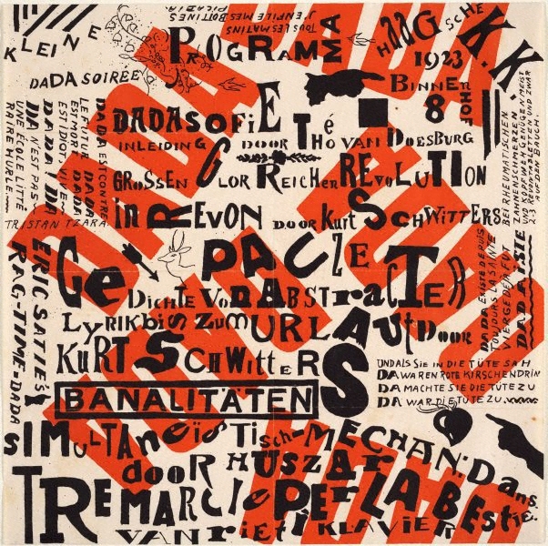
Kurt Schwitters, Theo Van Doesburg, 1923 - Kleine DADA Soiree
In 1923, Kurt Schwitters and Theo van Doesburg embarked on a tour of Holland— their so-called “Dada Campaign”—to introduce local artists to Dada through a series of evening lectures and performances. This poster for the Kleine Dada Soirée (Small Dada Evening) is a jumble of words that shift direction and overlap. The word “Dada,” is repeated in bold red letters in various orientations. Within the cloud of black lettering sit a few small images—a deer’s head, an arrow, pointing hands—cut from various sources and transferred onto the surface. Slogans in various languages proclaim: “Dada is against the future, Dada is dead, Dada is idiotic, Long live Dada!”
The poster’s discordant appearance reflects the tenor of many Dada evenings, which often commenced with mock lectures interrupted by barking audience members, absurd jokes and skits, and experimental poetry. This evening’s events included a prelude of “Dadawisdom” by Van Doesburg, “abstract poems declaimed as loudly as possible” by Schwitters, and ragtime music by composer Erik Satie.
Joost Schmidt, 1923 - Bauhaus exhibition poster
This poster, for the first Bauhaus exhibition in 1923, symbolises the highly experimental style adopted at the school through its use of confident, abstracted forms, bold primary colours and an array of highly geometric sans serif typefaces. All the visual elements have been reduced to their simplest of form, and flattened together on one two dimensional surface. This design was produced in the same year as the piece of Dadaist work, but they couldn't be more dissimilar in terms of their use of abstraction. They share similarities in the sense that they are both posters and both use a limited colour palette, but the messages are highly contrasting. This poster epitomises the modernist endeavour for neutrality and simplicity. The Bauhaus were determined to forge an aesthetic appropriate for the time, and this design certainly achieves this. Its visual elements are evidently inspired by the forms of machinery, and the colour treatment is responsive to this as well.
Herbert Bayer, Laszlo Moholy Nagy, Marcel Breuer - 1930
This poster abstracts the plain in a unique way, playing with the audiences's sense of depth and perception of form. Through the simple use of angular lines and flat colours, a composition is created which appears to escape the frame, expanding beyond the surface. Herbert Bayer's 'Universal' typeface has been modified here, aiding the overall theme of simplicity. This poster is evidently influenced by Russian Constructivism and Dutch De Stijl.
Beethoven poster, 1955, Josef Muller Brockmann
The Beethoven poster for the Tonhalle series is one of Müller-Brockmann's classics. The stark black and white and moving circle arcs hint at the drama of Beethoven's music. Here, abstraction of form is used as visual metaphor. The circulating pattern creates a building sense of atmosphere, visually expressing the complex, multi layer quality of the music. Brockmann is actually negating the surface, as he is not actually committing to imagery. His use of abstract shape negates realistic visual representations of the subject matter.
'The design of the music posters is a special case in that they were not sales oriented – their appeal was intended to be artistic. The stylistic difference between the posters with pictorial geometric forms and the purely typographic ones is that the latter contain no pictorial interpretation of the musical programme. Without exception they are free creations that took shape within the underlying grid system. For the most part the effect of these posters is lighter and more poetic.' - Interview with Brockmann - http://www.eyemagazine.com/feature/article/reputations-josef-muller-brockmann


No comments:
Post a Comment